Report
This section illustrates operations on the report and how to use them.
Parameter
This item is used to define parameters for report making.
About parameters:
It is seldom that data for report making is never changing. We often need to perform filtering to get desired data according to the specified condition. To do this we need to control data for report making through parameters. Take daily report making as an example. To make such a report, first a date parameter is passed to the report and then the daily report is generated according to the passed-in parameter.
A parameter can be referenced by a data set or an expression.
Using parameters in a SQL statement
Ø Syntax 1:

As the above figure shows, in SQL syntax, places parameters are used are taken up by question marks. You do not need to take care of the parameter’s data type as automatic type conversion will be carried out during execution. On the “Parameter” tab, you write parameter names or expressions according to the order of question marks, as the following figure shows:

Ø Syntax 2:


As the above figure shows, you define parameters for the report and then use them in any position of a SQL statement in the format of ${parameter name}, without defining them again through “Parameter” item.
Using parameters in query() function
Write question marks in a SQL statement and follow them with the comma and then parameters or parameter expressions. The number of parameters is same as that of the question marks.
● Example:
query("SELECT max(amount) FROM contract WHERE contract.signdate >? and contract.signdate <?", starttime, endtime)
Using parameters in an expression
(1) Directly reference a parameter name in an expression and use the parameter as a variable. If the parameter name is namesake with a field name or any other names, add @ before the parameter name, such as @parameter name.
Example: ="From "+string(@starttime)+" to "+string(@endtime)
(2) Use ${arg1} to reference a parameter in an expression
Example: =ds1.${arg1}
Defining parameters
Click Report -> Parameter to open the following “Parameter Editor” interface:

Click “Add” button to add a parameter definition, where you edit properties of the parameter, including name, description, data type, value expression and type. To delete a parameter, select it in the list and click “Delete” button. Click “Up”/ “Down” button to change a parameter’s position in the list. After finishing the editing, just click “OK”. Click “Copy” button to copy a selected parameter; press Ctrl to copy multiple parameters. Then open another report and click “Paste” button to add the copied parameter(s) to the “Parameter Editor” interface.
Name
You can use the default name for a parameter or rename it as needed, and reference the parameter name directly in a data set or an expression, such as starttime.
The parameter name should not be a keyword, such as __arg, __splHome, __rpx, __rpxHome, __rpg, name and id.
Description
You can use the default description for a parameter or edit it as needed. It is mainly used to record a parameter’s meaning, such as start time.
DataType
A parameter is a variable, so it has the data type. Data types supported in ReportLite are Int, Long, Short, BigInt, Float, Double, Decimal, Date, Time, Datetime, Boolean, String, Int array, Long array, Short array, BigInt array, Float array, Double array, Decimal array, Date array, Time array, Datetime array, String array, BLOB, Default, Auto and CLOB data type. Default data type for a parameter is string.
Among data types listed above, Int array, Long array, Short array, BigInt array, Float array, Double array, Decimal array, Date array, Time array, Datetime array, String array are of array type, which is for passing a group of parameters at one time. The array type parameters are widely used. They can work in a SQL statement and a cell, or is used for irregular grouping and expansion during report making as needed or required. Values of an array type parameter are separated by comma when entered, such as 1,2,3,4….
To get the number of elements in an array type parameter, use count(argName) function, where argName is an array type parameter.
To get the second element in an array type parameter, use argName(2) function.
As an array type parameter is an array set, it, like a set expression, can be written directly in a cell to for expansion.
For certain reports, the number of groups a report will be divided and how to divide them are indefinite. In this case, we can set parameter type as the corresponding array type and dynamically control the grouping operation through the input parameter value.
● Example:
Define parameter arg_1 and set its type as String array, enter =arg_1 in a cell and set the cell as horizontally expand.
Suppose the value assigned to the parameter is high school, college, undergraduate, graduate,
the cell will be expanded
horizontally as  ;
;
Suppose the parameter is
assigned as elementary school, junior high school, high school, the cell will
be expanded horizontally as  .
.
ValueExp
Set default value for a parameter under this property, or just leave it blank. The value will be treated as null when it isn’t specified.
Type
Under this property you can define a static parameter or a dynamic parameter. Details are explained below:
Type
There are two types of parameters: static and dynamic.
Static parameter
A static parameter will pass a fixed input value to the report for computations. If the input parameter value passed to the report is always fixed, the parameter is regarded as a static parameter.
Dynamic parameter
A dynamic parameter is an expression (not preceded by an equal sign). During report computation, it needs to be first parsed and the result of computing it will be passed to the report as the parameter value. Data type of the parameter is important when you use a dynamic parameter. Dynamic parameters are suitable for scenarios where expressions need to be dynamically parsed.
●Example: Find difference between a static parameter and a dynamic parameter.
In the following example, first we define parameters:

The three parameters have different types and data types. We specifically design a report to differentiate them:

For the convenience of distinguishing them, we set different background colors for cells holding them. The preview effect is as follows:

The above figure shows difference between a static parameter and a dynamic parameter and that between dynamic parameters clearly when they have different data types.
Parameter reference
Besides writing the parameter name in an expression to reference a parameter in a report, there are two other ways to reference it:
« @parameter name This enables using a parameter as a variable in an expression. It is during the process of computing the expression that the variable value will be referenced.
« ${parameter name} The syntax of ${parameter name} represents a string identifier for which data type is not specified. Before report computation, the system searches for the whole report definition globally and replace parameter name in all ${} with the parameter value. The parameter name in ${parameter name} cannot be enclosed within quotation marks.
In this way, you can perform expression replace dynamically in the report. According to different parameter values passed from the user, you can get different results for an expression in the report and different report information. This way there is no need to make multiple reports for different query requirements and workload is greatly reduced.
A property value cannot be referenced using the ${parameter name} format. Such a way of reference can be only used for an expression. And a parameter value in a data set property cannot not be referenced in this way, too. Yet the way applies in expressions in all the other cases.
Example:
Suppose a cell expression is =ds1.select(${arg1}) and arg1’s value is name, the expression will be replaced with =ds1.select(name) and then it is computed.
Dataset
Through this item, you can define data sets used in the report.
The concept of Dataset:
A dataset is a two-dimensional view, which is the data source of the report. The dataset can be obtained from a SQL query on the database or from a data file of different structure. It doesn’t matter for the report engine where data in the data set comes from. It only handles data in the data set for report computation.
Defining a Dataset:
Click Report -> Dataset or press F11 to open the following “Dataset Config” interface:
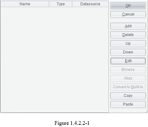
In the above interface, click “Add” button to add a data set; “Delete” button to delete a selected data set in the data set list; “Up” or “Down” button to change the position of a data set in the data set list; “Edit” to modify definition of a selected data set in the list; “Browse” to view data in a data set; “Alias” to give alias to a field in a data set; “Convert to Built-in” to convert an external data set to a Built-in one (A Built-in data set is one whose report data is stored in the report template); “Copy” to copy a selected data set (press Ctrl to copy multiple data sets); and open another report and click “Paste” to paste the copied data set(s) to their “Dataset Config” interface.
You can also create a data set through New Report Wizard during report making by clicking File -> New Report, as shown below:
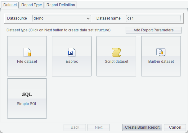
Select a data set type for the new report, or direcly click “Create Blank Report” to generate an empty report.
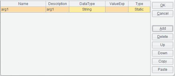
Note: If you select the SQL type data set and such a data set has parameters, you need to first add parameters in “Parameter Editor” interface:
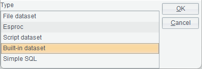
Dataset type:
ReportLite offers several types of data sets, including Simple SQL, Esproc, Script dataset, File dataset and Built-in dataset.
The choice of Simple SQL means that data originates from the database. A SQL statement is used to retrieve data meeting the specified condition from the database and generate a data set. Yet this type of data set does not require writing the SQL statement themselves. There is the visualized wizard interface through which users can select a query condition and the SQL statement is automatically generated. The data set is fit for users who are not familiar with SQL statements.
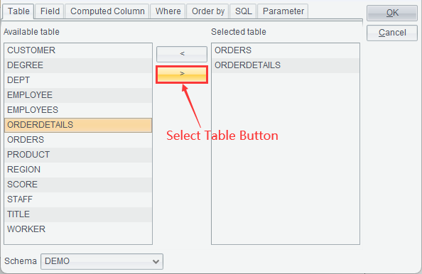
● Example: Create a simple SQL data set based on ORDERS table and ORDERDETAILS table.
1. On the “Dataset Config” dialog (as shown in figure 1.4.2.2-1), click “Add” button to get “Define Dataset Type” dialog, as shown below:

2. Select “Simple SQL” type and click “OK” to get into “SQL Editor” interface, as shown below:
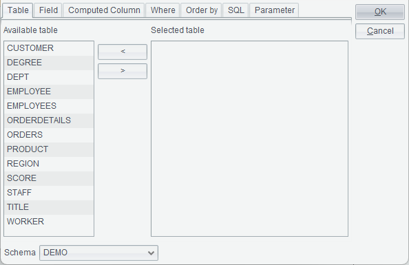
3. Select an option in the drop-down list of “Schema”, and select a data table under the “Available table” into “Selected table” through arrows between the two boxes (as shown below) or double-click a data table name to select the table.
4. Switch to “Field” tab, on which you select the corresponding data table in the data table drop-down list, where all available tables are listed, and then select desired fields into “Selected field” box through arrows between it and the “Available field” box, or double-click a field name to select the field.

5. Switch to “Computed Column” tab, on which you edit an expression by selecting the desired fields to “Computed Column” box through the arrow on the middle of the edit interface.
Here’s an example. The ORDERDETAILS table has UNITPRICE field and NUMBER field and we want to get the product of unitprice and number for each order. To do this we edit an expression under “Computed Column” – ORDERDETAILS.UNITPRICE * ORDERDETAILS.NUMBER as TotalAmt, as the following figure shows:

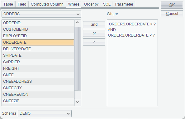
6. Switch to “Where” tab, on which you edit a conditional expression by selecting the desired fields to “Where” box through the arrow on the middle of the edit interface. To use parameters in the SQL statement, write question marks at the corresponding places according to the SQL syntax.
For example, suppose we want to get order records where order dates are within the specified time period from the ORDERS table, we can edit a conditional expression in “Where” box, such as ORDERS.ORDERDATE > ? AND ORDERS.ORDERDATE < ? , as shown below:
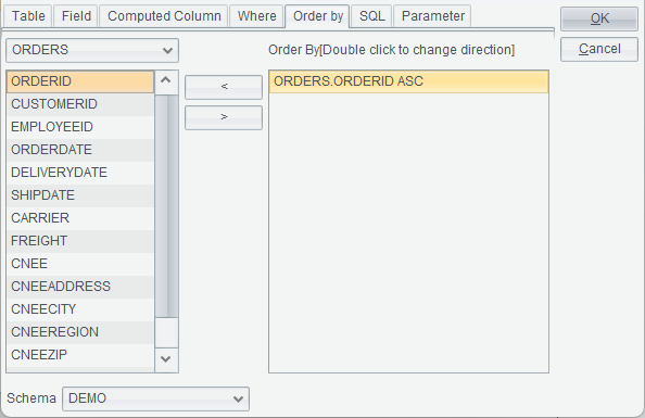
7. Switch to “Order by” tab, on which you selected fields to be sorted to “Order By” box through arrows in the middle of the edit interface, as shown below:
8. Switch to “SQL” tab to view the edited SQL statement. According to SQL syntax, question marks are automatically generated at places where parameters are needed. In the above query condition, two question marks are used, as shown below:
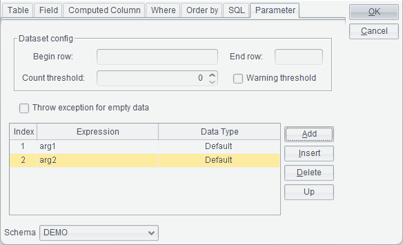
9. Switch to “Parameter” tab, on which we write parameter names or parameter expressions (not preceded by the equal sign) according to the order of question marks. Here you do not need to take care of data types of the parameters because they will be automatically converted by the system, as shown below:
Dataset config: For retrieving data by rows for the data set.
Begin row and End row: For controlling the number of rows in the data set. If a large volume of data is needed for report making, you can change the begin row and end row through parameters. Generally speaking, both the begin row and end row are input parameters and row numbers are controlled through those parameters. It makes no sense to enter constants.
Count threshold: When generating a data set from a large volume of data, the system often responses very slowly. We set a threshold value (int) and when the actual number of records retrieved exceeds the value the computation stops. The default threshold value is 0, meaning there is no limit to the number of retrieved records.
Warning threshold: By checking this option, the number of records to be retrieved will be computed, and judged to see whether it exceeds the threshold number or not before the records are used to generate a data set. If the option is not checked, the data set will be directly generated, during which if the number of records exceeds the threshold value the generation process will be terminated and the data set will be emptied.
Note: The two options – “Count threshold” and “Warning threshold” become invalid when the to-be-generated data set is big.
10. Click “OK” button to go back to “Dataset Config” interface. If you don’t want to use the default data set name, you can rename the data set manually. You can also select a different data source. Then click “OK” button to finish define the data set.
An Esproc data set refers to a data set whose data is obtained from an esProc file. The result of computing the esProc file is returned as the data set for ReportLite through return statement or without it (without the return statement and if the last statement of the esProc file is held in an assignment cell, its result will be automatically returned).
Below is “esProc dataset” interface:

SPL: Click
 button after “SPL” to
select an esProc file (whose extension is .splx/.spl./.dfx).
button after “SPL” to
select an esProc file (whose extension is .splx/.spl./.dfx).
An esProc file path can be an absolute one or a relative one. A relative path is relative to the search path configured in Tools -> Options -> Esproc options. The property is consistent with splPath path in Esproc in raqsoftConfig.xml. Do not precede a slash / before a relative path when using it.
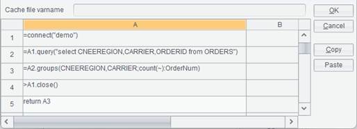
Cache file varname: The Cache file varname corresponds to buffer file variable in the esProc file.
Data management mode: Buffering and SPL self-managing.
Cache – Retrieve data based on buffer file.
SPL self-management –Retrieve data through the custom SPL statement.
Parameter: If an esProc file defines parameters, ReportLite will automatically load parameter names from the esProc file into the parameter list. Parameter names in the parameter list correspond to those defined in the esProc file. Parameter values can be regular values or report parameters. When using report parameters as parameter values, we can compute them through expressions (here report expression syntax is used) and pass their results to the esProc file as parameters.
Note:
When a data set is used to make a big report and a custom buffer file needs to be defined for the esProc data set, the Cache file varname should be set as esProc buffer file variable.
● Example:
Below is content of an esProc file:
1. Click “Add” button in “Dataset Config” window to pop up the following “Define Dataset Type” dialog:
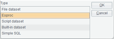
2. Select “Esproc” data set type, and click “OK” button to get into “esProc dataset” edit interface, as shown below:

3.
Click button after “SPL” to
select an esProc file:
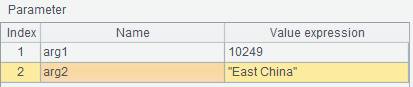
ReportLite automatically loads parameters from the esProc file into the parameter list:
4. Click “OK” button to create the Esproc data set.
To learn more about esProc data set, see esProc Data Set in Tutorial.
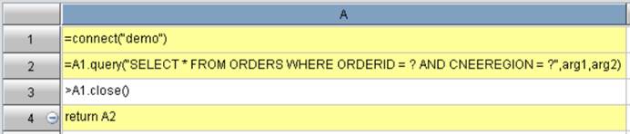
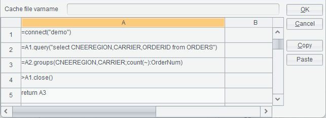
●Note: An esProc file used as the Esproc data set can directly use db.query() function if it is the report’s currently connected data source and as the application has a mechanism that automatically connects to the database in this case. If it isn’t he report’s currently connected data source, you need to establish the connection to the esProc file through connect(”db”) function before performing queries and close the connection using close() function after queries are over.
Example: The following SPL file uses the same data source as the report uses, so it can directly use db.query() function to perform queries:

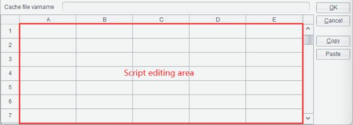
You can add a computing expression directly in the script editing area (highlighted in red box in the following figure). The result set is returned to ReportLite data set through return statement or without it (without the return statement and if the last statement of the script is held in an assignment cell, its result will be automatically returned). The expression in the script edit area should conform to esProc syntax.
Below is “Script dataset” interface:
Cache file varname: This option is used to set buffer file name for the convenient of calling the buffer file in the script when the data set is for generating a big report.
Note:
When a data set is for generating a big report, the script must return a cursor.
● Example:
1. Click “Add” button on “Dataset Config” window to pop up “Define Dataset Type” dialog:

2. Select “Script dataset” type and click “OK” button to get into “Script dataset” edit interface, as shown below:
Edit a script in the script editing area or paste an existing script here (select a cell and click “Paste” button). If parameters need to be passed to the script, you can define them in the parameter list of the report file, where parameter name are those defined in the script.
3. Click “OK” button to generate the script data set.
●Note: Same as the case for the Esproc data set, a script used as the script data set can directly use db.query() function if it is the report’s currently connected data source and as the application has a mechanism that automatically connects to the database in this case. If it isn’t he report’s currently connected data source, you need to establish the connection to the script through connect(”db”) function before performing queries and close the connection using close() function after queries are over.
A file data set refers to a data set that gets data from a file, which can be txt, xls, xlsx, csv, btx (bin file) and ctx (composite table file).
When the file is a btx file (bin file) or a ctx file (composite table file), you can only retrieve data from a base table.
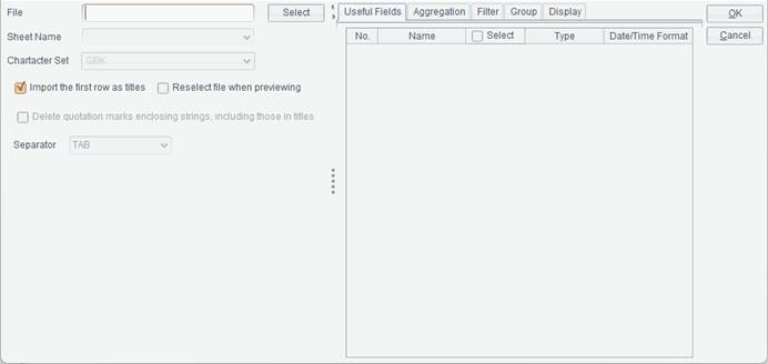
Below is “File dataset” interface:
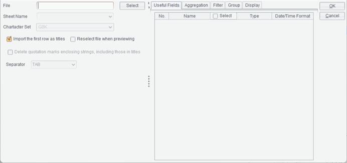
File: The file name, which supports absolute path or relative path. When using a relative path, the path does not need to be preceded by the slash /. The relative path is relative to the Resource directory configured in Tools -> Options -> File; the property corresponds to the path in home property in configuration file raqsoftConfig.xml’s <Report>.
Sheet Name: When the file type is Excel, the option is used to select different worksheets in the Excel file.
Character Set: The character set for a text file or a CSV file. The character set types include GBK and UTF-8.
Import the first row as titles: Whether or not to use content of the first row in the file as titles by checking or unchecking this option.
Reselect file when previewing: To view data in the data set or preview the data set, you can reselect the data set file on the pop-up “Reselect dataset file” dialog.
Delete quotation marks enclosing strings, including those in titles: Whether or not to delete quotation marks in the outermost layer of a string.
Separator: The separator for separating fields of a text file. Types of separators include TAB, comma (,) , space, vertical line (|), dash (-) and underline (_).
Note: The separator for separating fields in a CSV file can only be the comma.
Begin Row/End Row: When the file type is Excel, there will be Start Row/End Row option for determining the number of rows to be retrieved from the Excel file.
When selecting File dataset, sometimes there is a huge volume of data in the source file. In order to avoid loading unwanted data and memory overflow, you can use the following method to reduce size of the target data set:
Useful Fields: Select the source file and then target fields.
Aggregation: Perform aggregation on a field.
Filter: Perform filtering to get records meeting the specified condition, where parameters are not allowed. The filter condition should meet the specified Boolean expression; multiple Boolean expressions can be concatenated through the logical operator, such as && and ||.

Group: Select the field by which records are grouped and summarized.

Note: “Group” and “Aggregation” should work together. Configuring “Group” alone is invalid and only the original data will be obtained.
Display: Fields to be displayed in the to-be-generated data set.

● Example: Create a File dataset based on orders.txt.

1. On “Dataset Config” shown in figure 1.4.2.2-1, click “Add” button to pop up the following “Define Dataset Type” dialog:

2. Select “File dataset” type and click “OK” button to get into the following “File dataset” interface:
3. Click “Select” button to select orders.txt or just enter the file path. For instance, when the Resource directory on File tab in Tools -> Options is C:\raqsoft\ReportLite\demo and orders.txt is located in demo folder, just enter orders.txt.
4. Select the character set the file uses, and default is GBK. By default, “Import the first row as titles” is checked. Then select the “Separator” between fields, whose default is TAB. Now “File dataset” interface becomes as follows:

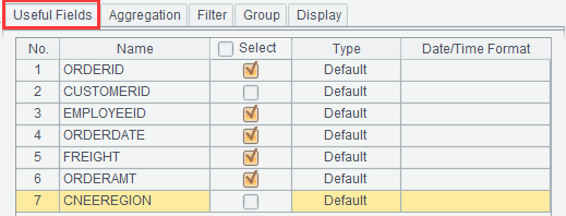
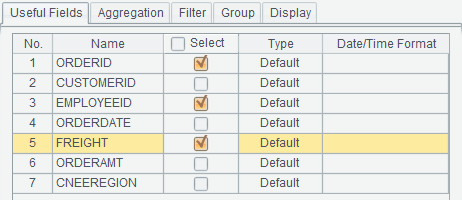
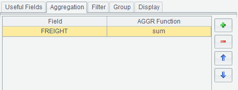
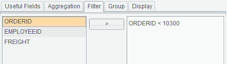
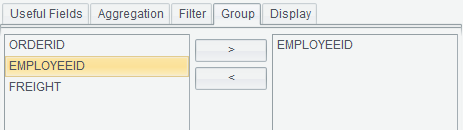
5. Select “Useful Fields”, set aggregation operation, filter condition, grouping field and to-be-displayed fields in the data set.
The useful fields selected are ORDERID, EMPLOYEEID and FREIGHT:
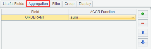
Perfrom sum on FREIGHT field:
Set filter conditon as ORDERID < 10300:
Group records by EmpID:
Select fields to be generated in the data set:

Click “OK” button to finish creating the File dataset.
A Built-in dataset refers to a data set whose structure and data are stored in report template, so there is no need to retrieve data from the data source during report computations. This lets users to make a report fast and conveniently by defining only a Built-in dataset in ReportLite designer and entering certain data into it. The user experience improves greatly. It also can be used for monitoring and debugging reports. If the report preview effect is not what you expected, you can transform the data set to a Built-in one and give the report template to technical support team for their convenience of monitoring and debugging.
Below is “Built-in dataset” interface:

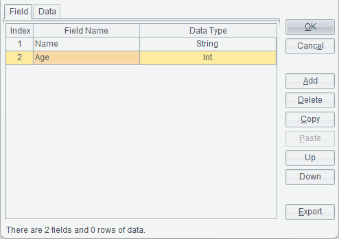
● Example: Create a Built-in dataset containing name and age.
1. On “Dataset Config” window shown in figure 1.4.2.2-1, click “Add” button to pop up the following “Define Dataset Type” dialog:
2. Select “Built-in dataset” type and click “OK” button to get “Built-in dataset” window, through which you define fields and data values for the data set. On “Field” tab, you define fields in the Built-in dataset. Click “Add” button the right side and a new field definition appears in the field list on the left side. You can modify field name and the field’s data type as needed. For instance, define Name field and Age field for the data set, as shown below:
3. Switch to “Data” tab, where you click “Add” button to add values under the fields, as shown below:

You can also copy the existing data in an Excel file and paste it to the Built-in dataset. First, copy data values of an Excel file. Then click “Paste” button on “Data” tab in “Built-in dataset” window to past the copied data to the Built-in dataset.
4. Click “OK” button to finish creating a Built-in dataset.
You can transform an external data set to a Built-in dataset or restore a Built-in dataset to an external data set.
On “Dataset Config” windows shown on figure 1.4.2.2-1, select a data set in the data set list and click “Convert to Built-in” button to convert an external data set to a Built-in one, as shown below:
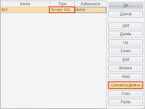
After data set ds1 is converted to a Built-in dataset, the “Convert to Built-in” button is changed to “Recover”. Now select ds1 in the data set list and click “Recover” button, the Built-in dataset is restored to the original “Simple SQL” data set, as shown below:
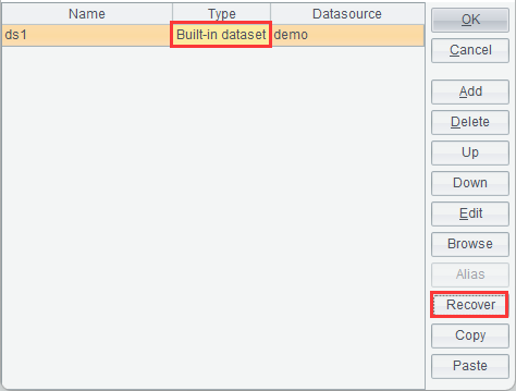
●To restore a Built-in dataset to an external one, the former should be a data set converted from an external data set. A Built-in dataset created by the user cannot be restored to an external data set.
Report properties
Through this item, you can set global properties for a report.
Click Report -> Report properties, or select primary cell of the report and click right-click menu -> Report properties, or press Ctrl+B to get into “Report Properties” interface, where you can switch between General, Print, Page Break, Export, Background and Subreport to configure related report properties. Below is “Report Properties” interface:

General
Click “General” tab on “Report Properties” interface to configure the report’s basic properties, as shown below:

Big dataset name
When trying to compute a huge volume of data, we can select the Big dataset name for a data set. Only Simple SQL, Script dataset and Esproc are supported.
Note: A big report can be only exported to Excel2007 for the time being.
Reporting Unit
Under “Reporting Unit”, you can select a unit for the report, millisecond, pixel and inch.

When millisecond or inch is selected, the report’s column width or row height is actually plotted in pixel. Since the result of millisecond and inch’s conversion to pixel is always rounded up, deviation becomes large when the number of columns is large, too. It is recommended that “High precision” check box is checked in this case to enable high-precision arithmetic that does not round up the result so that column width and row height will be plotted in actual pixel and errors can be avoided.
A numeric property, such as height and width under row and column properties and margin-top/margin-bottom/margin-left/margin-right properties for charts, in ReportLite is configured only by entering a number without specifying the unit. By default, they use the one configured under “Reporting Unit”.
The unit for paper-size related properties under “Report properties” is specifically specified as mm (milliseconds), so they won’t use the unit specified under “Reporting Unit”.

Max Image Size
You can specify size of an image in the report through “Max Image Size”. When an image exceeds the specified size, the system will automatically call [installation directory]\reportlite\logo\outsize.gif file to replace the original large image with it. Users can also change outsize.gif to their own image and replace an image whose size is greater than the specified one.
Display Scaling
By changing value under “Display Scaling”, you can adjust the percent of displaying the target report and the report preview for convenience of viewing without changing size of the report itself. ReportLite offers several zoom options – 200%, 133%, 100%, 75% and 50%. You can set a desired display ratio through the Custom zoom setting box – “Percent”.
There is a report, for instance, you need the scrollbar to view the whole report when the report is displayed at 100% size, but you can view it wholly without the scrollbar if it is shown at 75% size, as shown below:


Cell Count
“Cell Count” specifies the estimated number of cells a report has. It is used for concurrency control by report engine on a report stored in the memory. In the report configuration file, you can set the maximum number of cells reports can have in the memory through maxCellNum and the the estimated number of cells through defaultCellNum. Before report computations, the report engine first reads the target report’s “Cell Count” property, parses the expression specified in it and computes the estimated number of cells in the target report. If “Cell Count” isn’t specified, use value of defaultCellNum as the estimated number of cells. During the concurrency computation, if sum of total number of report cells and the estimated number of cells in the current report exceeds value of maxCellNum, the report engine will delay computing the report; otherwise, it performs computations at once. The number of cells increases during the process of concurrency computation and decreases when the computation is over.
Below is a staff information report:

It has 6 columns and the number of rows expanded for it is ds1.count(). You can set “Cell Count” as (ds1.count()+1)*6 in “Report Properties”, as shown below:

Once computations on the employee information report are finished, the number of cells it occupies is (ds1.count()+1)*6. Before report engine begins computations on employee information report, it first obtains the report’s “Cell Count” property, calculates sum of total number of cells engaging in the concurrency computation and employee information report’s “Cell Count” value, compares the summing result with maxCellNum configured in the configuration file, and delays the computation if the sum exceeds the maxCellNum value or begins the computation at once if the sum is within the limit.
●The “Cell Count” value can be an integer or an expression that does not need to be preceded by the equal sign.
Report Style
After a report style is configured under “Report Properties”, the style will be automatically listed in cell style names on the right side. Configurations of report styles can be found in reportStyleConfig.xml file in [installation directory] \reportlite\tmp.
Refresh
Refresh the report style drop-down list.
Prompt
Uses to be determined.
Note
The report maker can enter notes and descriptions here for the convenience of their or other people’s lookup.
● Example:
Take “Employee information query” report as an example, you can enter “Enter an EmpID in parameter value to query detailed information about the employee” in note edit box. Later when anyone opens the report, they will know what the report is for by checking the note.
Switch to “Print” tab in “Report Properties” interface to configure information about printing the report, as shown below:

Paper Type
The paper type refers to default paper size the report uses when it is printed or exported. The property is only valid when “Page Break Mode” property value is “Page break by paper”. Except for standard paper size, ReportLite also allows users to define paper size as needed after “Custom page height” and “Custom page width”.
Size unit:
|
Paper Type |
Width (millisecond) |
Height (millisecond) |
|
A0 |
841 |
1189 |
|
A1 |
594 |
841 |
|
A2 |
420 |
594 |
|
A3 |
297 |
420 |
|
A4 |
210 |
297 |
|
A5 |
148 |
210 |
|
B0 |
1000 |
1414 |
|
B1 |
707 |
1000 |
|
B2 |
500 |
707 |
|
B3 |
353 |
500 |
|
B4 |
250 |
353 |
|
B5 |
176 |
250 |
Paper size conversion formula: (1mm×72)/25.4=1pixel
72 pixels=1inch
Orientation
Default direction of paper for print or export, including Portrait and Landscape. Default direction is Portrait. When a report is short and wide, you can set “Orientation” as “Landscape”.
Custom page height
When paper type is “Custom”, the system reads “Custom paper height” value as the height for report printing.
Custom page width
When paper type is “Custom”, the system reads “Custom paper width” value as the width for report printing.
Margin

Top: Default top margin for report print or export.
Bottom: Default bottom margin for report print or export.
Left: Default left margin for report print or export.
Right: Default right margin for report print or export.
Print Zoom
Zoom Mode: Set zoom mode for report printing. Three zoom modes are offered – Zoom to paper height, Zero and Zoom to paper width.
Zoom to paper height: Print the report according to paper height.
Zero: Print the report in its original size.
Zoom to paper width: Print the report according to paper width.
The “Print Zoom” applies when report is exported to a Word document.
Horizontal Alignment
Set horizontal alignment mode for printing a report on paper through this item. There are three modes – Center, Left and Right.
Vertical Alignment
Set horizontal alignment mode for printing a report on paper through this item. There are three modes – Center, Top and Bottom.
Switch to “Page Break” tab in “Report Properties” interface to configure page break information for report printing, as shown below:

Print Mode for Vertical Pagination
The item is used for setting printing mode of header & footer and title for vertical pagination.
There are two printing modes – “Print on Each Page” and “Print on First Page Only” – for both header & footer and the title.
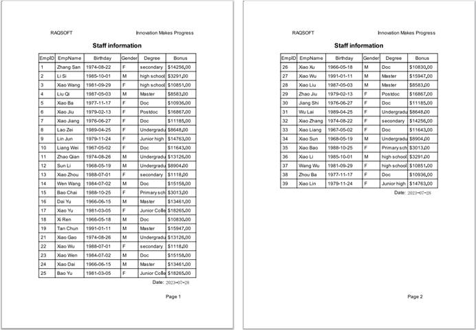
1. Print on Each Page
Sometimes people will look up different pages of the same report and those pages are not stored together. In order to let every user know about the report’s header & footer and the title during report lookup, the related information need to be printed on each page. To do this, you just select “Print on Each Page” in both the drop-down list of “Header & Footer” and that of “Title” under “Print Mode for Vertical Pagination”.
The preview shows that header & footer and the title are displayed on both the first page and the second page. The print preview effect is as follows:

2. Print on First Page Only
Sometimes you need to bind up the printed report pages and put them away, and just want to print header & footer and the title on the first page. To do this, you just select “Print on First Page Only” in both the drop-down list of “Header & Footer” and that of “Title” under “Print Mode for Vertical Pagination”.
The preview shows that header & footer and the title are displayed on the first page while they are hidden on the second page. The print preview effect is as follows:

Print Mode for Horizontal Pagination
Sometimes one record contains so many fields that the width of a single page cannot accommodate the whole record. In this case, we set horizontal pagination for the report. The “Print Mode for Horizontal Pagination” item is used for setting printing mode of header & footer and title for horizontal pagination.
There are four printing modes – “Print on Each Page”, “Print on First Page Only”, “Print Specified Part on Each Page” and “Print Specified Part on First Page Only” – for both header & footer and the title when a report is paginated horizontally.
1. Print on Each Page
Sometimes a printed horizontally-paginated multi-page report is stored separately and users only look up pages they interested in. In order to enable every user to view the report’s header & footer and title during report lookup, the related information needs to be printed on each page. To do this, you just select “Print on Each Page” in both the drop-down list of “Header & Footer” and that of “Title” under “Print Mode for Horizontal Pagination”. The print preview effect is as follows:

2. Print on First Page Only
Sometimes a printed horizontally-paginated multi-page report is required to have header & footer and title on the first page without printing them on the other pages. To do this, you just select “Print on First Page Only” in both the drop-down list of “Header & Footer” and that of “Title” under “Print Mode for Horizontal Pagination”. The print preview effect is as follows:

3. Print Specified Part on Each Page
Sometimes users require that a specified part of the header & footer and title be printed on each page for horizontal pagination and pages be pieced together to form the target report. To do this, you just select “Print Specified Part on Each Page” in both the drop-down list of “Header & Footer” and that of “Title” under “Print Mode for Horizontal Pagination”. The print preview effect is as follows:

4. Print Specified Part on First Page Only
Sometimes users require that a specified part of the header & footer and title be printed on the first page only for horizontal pagination while leaving the other pages blank in the corresponding places. To do this, you just select “Print Specified Part on First Page Only” in both the drop-down list of “Header & Footer” and that of “Title” under “Print Mode for Horizontal Pagination”. The print preview effect is as follows:
Print Mode of Header/Footer
This is used for setting up the printing mode for report header and/or footer.
You can set up header/footer print mode on rows and column. For rows, you can set up print mode for both report header and footer. There are two modes in this case – “Print on First Page Only” and “Print on Each Page”. For columns, you can set up print mode for the left header. There are the same two modes in this case, too.
1. Print on First Page Only
Some users require to display header and footer only on the first page while leaving the corresponding places blank on the other pages. For instance, when the report width is greater than paper width, we only need to print header and footer just on the first page instead of all pages. When the whole report is printed, we piece all pages together horizontally and they share header and footer printed on the first page. If we set up “Print on First Page Only” on rows, the report header and footer areas will be printed only on the first page. If we set up the same print mode on columns, the left header will be printed only on the first page.
Set up “Print on First Page Only” for both “Row” and “Column” under “Print Mode of Header/Footer”. The print preview effect is as follows:
2. Print on Each Page
Some users require to display header and footer on every page. To do this, set up “Print on Each Page” for both “Row” and “Column” under “Print Mode of Header/Footer”. The print preview effect is as follows:

Page Break Mode
There are three modes – Page break by paper, Page break by row and No page break.
1. Page break by paper
Choosing “Page break by paper” means that the report will be automatically paginated according to the specified paper size and the part exceeding the size will be printed on the next page. This mode is fit for scenarios where there are no requirements on the number of records printed on a single page. Below is print preview effect:
2. Page break by row
In certain occasions users require to print records of the specified number of rows in a single paper. To do this you can choose “Page break by row”, which enables to paginate the report according to the specified number of data rows on a single page and print the rows exceeding the specified number on the next page. For instance, we set up “Page break by row” for “Page Break Mode” on the “Page Break” tab and type 15 in “Row Count per Page” edit box, and we get the following pagination effect by printing 15 rows on each page:

In pagination by row setup, you can specify a fixed number of rows for each page or specify a dynamic number, which is also set up through “Row Count per Page”.
Note: By selecting “Page break by row”, you disable the “Print Zoom” options.
3. No page break
Sometimes for the convenience of viewing, users require to print all information in a report on a single paper. In this case you do not need to paginate the report. Other times when you need to print a report based on an existing template, you scan bills to be printed into images, insert them onto the report design interface and plot the report in the base picture. The report information will be printed together with the base picture, and in order to ensure the target report is not dislocated you should not use the pagination function. In those two cases, you set up “No page break” for “Page Break Mode” on the “Page Break” tab and the print preview effect is as follows:

Header/Footer Border
There are two border types for headers and footers – Default and Custom.
If no line style is specified for the top border of cell directly above the footer, the value you select for “Border of Header/Footer” determines whether or not to use line style of bottom border of the neighboring cell of the cell directly above the footer.
Row Count per Page
If “Page Break Mode” is “Page break by row”, you can set the number of rows displayed in the data area in each page through “Row Count per Page”.
You can specify a fixed
number of rows for each page, or achieve dynamic page break through a
parameter. Click  after “Row Count
per Page” to pop up the Expression Editor dialog, where you can set up parameter
expressions to achieve dynamic page break, as shown below:
after “Row Count
per Page” to pop up the Expression Editor dialog, where you can set up parameter
expressions to achieve dynamic page break, as shown below:


The print preview effect is as follows:

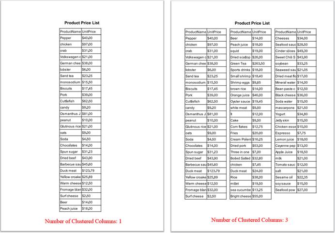
Number of Clustered Columns
Through this item you can set the default number of horizontally clustered columns in a report at print or export. Often, we have reports that have many rows but only several columns. Such a report is long and narrow, and there will be large white spaces horizontally when it is printed on an A4 paper. This is neither economical nor neat and convenient to view. Displaying the report as horizontal, multiple clustered columns in papers is neat and economical and makes it convenient to look up information. In a report with horizontally clustered columns, the header repeats above each clustered column, but the report title can appear only once.
Let’s set up “Number of Clustered Columns” in “Page Break” tab as 3, and the print preview effect is as follows:
Repeat Header for Each Clustered Column
This is used to set up whether or not to repeat the header for each clustered column.


Switch to “Export” tab on “Report Properties” interface to set up whether or not to export background image and password and privilege when the report is exported as a PDF file or an Excel file, as shown below:

Do not export background image
Set up whether or not to export background image at when exporting a report.
Do not export following URLs
Specify which URLs among hyperlinks in cells of the report won’t be exported. Add a URL by clicking “Add” button and delete a URL from the URL list through “Delete” button.
Set password and privilege of the PDF file to which the report will be exported.
User password: The password users need to enter when viewing the exported PDF file; in this case users can only view the PDF file.
Owner password: The password users need to enter in order to edit the exported PDF file.
File privilege: The user privileges for performing certain operations on the exported PDF file; just check the options to get the corresponding privileges.
Enable high-performance: By checking “Enable high-performance” option for export or in a flash print, the report will be exported in continuous strings rather than character by character. This is fast and the file for storage is relatively small. But there will be a few differences from the original because of the nuances between PDF and JAVA in characters. When this option is not checked, the report will be exported to a PDF file or as an SVG image character by character or coordinates by coordinates. That is slow, but the result coordinates are completely same as the original.
Excel

File password: The password you need to enter in order to open the Excel file.
Do not export hidden rows/Do not export hidden columns: Set up whether or not to export the hidden rows or columns.
Set page break for a single Excel sheet: When exporting the report to a single Excel worksheet, set up whether or not to specify the page break according to the way the report is paginated so that the Excel sheet has similar pagination effect.
Hide gridlines: Set up whether or not to hide gridlines in the exported Excel file.
Switch to “Background” tab in “Report Properties” interface to configure background image information for the report. The background image can be an image or a watermark, as shown below:

Display Mode
Set display mode of the background image. There are two modes: Display per page and No Display.
Blank
Remove the background image object.
Image
Set Mode, Source and URL of the background image.
Mode: Top left, Fill and Tile.
1. Default is Top left. By using this mode, the background image is displayed in its original size starting from the top left corner of the report while leaving the rest of the report area blank and cutting off the extra area. The effect is as follows:

2. With “Fill” mode, the background image is zoomed to the report size. Effect is as follows:

3. The “Tile” mode enables displaying the background image in its original size and automatically copying itself to fill in the whole report. Effect is as follows:

Source: Select type of the background image origin. They are URL and Expression.
For instance: URL

Watermark
On this tab, we can set the watermark’s mode, source, text, font, font size, color, space and transparency.
Mode: Set watermark mode – Normal or Tilt.
Source: Set source of watermark – Text or Expression.
Font: Set font format for watermark.
Font size: Set font size of watermark.
Color: Set watermark color.
Space: Set gap between watermarks.
Transparency: Set degree of transparency for watermark.
For instance: Text mode

Eeffect is as follows:

Switch to “Subreport” tab on “Report Properties” interface and define subreport to be inserted into the report, as shown below:

Click “Add” button to automatically add a subreport in the subreport list.
Click “Delete” button to automatically delete from the subreport list a selected subreport.
Name
Define name of the subreport. Use the name to represent the subreport wherever it is used.
URL Type
Set type of the subreport’s URL – Relative path or Absolute path.
1. Relative path
A relative path is relative to【Resource directory】in【Tools】à【Options】à【File】.
A relative path does not need to be preceded by slash “/” while an absolute path needs to be headed by the drive letter or slash “/”. An absolute path led by slash “/” represents one having the root directory of the current drive. /demo means D:/demo when the application’s root directory is D drive.
2. Absolute path
An absolute path is the real path a subreport has on the disk. Select “Absolute path” under “URL Type” column and double-click “URL” edit box to get the following “Open” dialog:

Select location of the subreport and click “Open” button and the subreport’s absolute path will be automatically entered in the “URL” edit box.
Row properties
Through this menu item, you can set properties for each row in a report.
Click primary cell of a row to select the row for which row properties need to be configured, select Row properties on the right-click menu or click Report -> Row properties to pop up the following “Row Properties” dialog”:

In this dialog, you can set up a series of properties including “Height”, “Type”, “Group Header Level”, “Page Break After Row”, “Visible” and “Fill after Page Break”, and then click “OK” button. You can also click a primary cell to select a row and configure those properties in row property list on the right part of the designer.
Fill after Page Break: If contents of cells cannot fill the whole page before pagination, expand the cell containing long text using white space to fill up the page.

Row Type: Used to mark which area the current row belongs to.
Page Header
The page header, which generally contains page-related information, is located in the top of each page and displays only at print or during print preview. You can select Print on Each Page or Print on First Page Only.
Header Title
The header title area contains report title and relative information, including print date, report unit and amount unit, etc. select Print on Each Page or Print on First Page Only.
Report Header
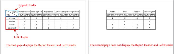
The report header generally contains names of columns in the report. There are three options under this item – Print on Each Page, Print on First Page Only, Repeat Report Header for Each Clustered Column.
Group Header
The group header repeats on each page of a paginated report, but it does not repeat for each clustered column. When a report is paginated by a specified number of rows, the number is sum of row count in group header area and that in data area.
“Group Header Level” is used to set level of a group header in a multilevel report.
Example 1: Group headers in a triple-level report.

Set row type of the first three rows as “Group Header”. Set “Group Header Level” of the 1st row as 1, which represents a first-level group; that of the 2nd row as 2, which represents a second-level group; and that of the 3rd row as 3, which represents a third-level group. A group header repeats on each page of a paginated report. The print preview effect is as follows:

Example 2: The single-level, multi-row group header.

Set row type of the first four rows as “Group Header”. Set “Group Header Level” of the 1st row as 1; that of the 2nd row as 2; that of the 3rd row as 3; and that of the 4th row as 4. The first-level group consists of four rows. The print preview effect is as follows:

●Single-level group headers can consist of multiple rows, whose header levels increase in order (as shown in Example 2). In a multilevel group header, each level can only involve one row and header levels of rows increase in order (as shown in Example 1).
Data
Data area contains data that a report retrieves from the data set.
Report Footer
The report footer area contains summarization information and other information commonly displayed in report footer.
Footer Title
The footer title area contains report footer title and footnotes that usually displayed in this area. You can select Print on Each Page or Print on First Page Only.
Page Footer
The page footer, which generally contains page-related information, is located at the bottom of the page and only appears only at print or during print preview. You can select Print on Each Page or Print on First Page Only.

●Vertically, different areas of report from top to bottom are Page Header -> Header Title -> Report Header -> Group Header -> Data -> Report Footer -> Footer Title -> Pager Footer in order.
●The vertical order of areas of report should not be changed.
●Except the Data Area, all the other areas of the report can be absent.
●A merge cell cannot belong to different areas, otherwise pagination will be disrupted.
Column properties
Through this menu item, you can set properties for each column in a report.
Click primary cell of a column to select the column for which column properties need to be configured, select Column properties on the right-click menu or click Report -> Column properties to pop up the following “Column Properties” dialog”:

In this dialog, you can set up a series of properties including “Width”, “Type”, “Page Break After Column” and “Visible”, and then click “OK” button. You can also click a primary cell to select a column and configure those properties in column property list on the right part of the designer.
Column Type: Used to mark which area the current column belongs to.
Left Header
A header column contains names of data rows in a report. When width of a report is greater than that of the displayed paper area, you need to set up the header column. You can select Print on Each Page or Print on First Page Only for the header column during pagination. When you select Print on First Page Only, the left header will be printed only on the first page.
Normal
The Normal area contains data the report retrieves from the data set.

●Horizontally, different areas of report from left to right are Left Header -> Normal.
●The Left Header can be absent.
●A merge cell cannot belong to different areas, otherwise pagination will be disrupted.
Borders
Through this item, you can configure borders of a report and other properties such as slash mode and color.
In a report, select a cell for which borders will be set and click Report -> Borders or right-click menu -> Borders to pop up the following “Border Settings” interface:

On this interface, you can
select the desired border type and set up color, style and weight of border
lines, then click “OK” button to finish the configuration. You can also
configure them through buttons  on the toolbar.
Border settings involve both slashes and borders.
Slash
You can configure color, style and thickness for slashes in a selected cell.
In many reports, the cell at the top-left corner of the header area contains one or two slashes. The cell slash property is created for them.
One cell can contain two slashes at most. Data values separated by slashes are configured in cell’s value property and delimited by comma.
Example:

Data values in the slash-separated cell are Name, Subject and Score.
Border
Set borders for a certain cell or the whole report.
●Only one type is allowed for a merge cell’s borders on the same side. You should not segment a merge cell and display borders in different modes.
Example:

The top-left cell has red, solid borders with thickness of 0.75mm;
The top-right cell has dotted and dashed borders with thickness of 1.5mm;
The bottom-left cell has dashed top and bottom borders with thickness of 0.75mm;
The bottom-right cell has a double-line bottom border with thickness of 0.75mm.
Note: For a merge cell, one border should have a consistent type and cannot be divided to set different types. Once borders of a neighboring cell are configured, the whole border of the merged cell is also configured accordingly.
As the following figure shows:

If you set double-line borders for the merge cell’s neighboring top-left cell, the preview effect is as follows:

The whole top border of the merge cell is also configured as a double line.
In order to avoid such an effect, you can insert a row above the merge cell and reduce the row height as much as possible until it becomes what the following figure shows:

Now preview effect is as follows:

Graph
This item helps you to design various types of graphs to present information of a report visually and intuitively.
Select a cell where a graph will be plotted and click Report -> Graph or right-click menu -> Graph to pop up “Graph properties” interface, where you define related properties for the to-be-plotted graph, as the following figure shows:

When you finish configuring graph properties, click “OK” button and the desired graph will be automatically inserted into the cell selected in the designer.
Graph Type and Data
Click “Graph Type and Data” to enter the tab, as the above figure shows:
Dataset
When you need to directly reference a dataset’s field or a parameter value in the graph data, you can select a reference type in the dataset drop-down list.
Ⅰ. Select parameter
Parameter:


After the “Parameter” reference type is selected, the current parameters will be listed in the graph data drop-down list. Each parameter is displayed in the format of @parameter name[parameter description].
Ⅱ. Select a dataset name
Dataset ds1:


After a dataset name is selected, fields of the dataset will be automatically listed in the graph data drop-down list for selection:

Graph Type
ReportLite supports thirty types of graphs, including Column, 3D Column, 3D Custered Column, Stacked Column, 3D Stacked Column, Pie, 3D Pie, Line, Curve, 3D Line, Area, 3D Area, Bar, 3D Clustered Bar, Stacked Bar, 3D Stacked Bar, Scatter, 3D Scatter, Run, Time Series, Dual-axis Column, Dual-axis Line, Dual-axis Stacked Line, Radar, Gantt, Dashboard, Milestone, 3D Dashboard, Range and ɪ-shaped. You can select the desired one in the drop-down list as needed.
A column graph uses a unit length to represent a certain quantity. According to quantities, we draw a column graph where columns are proportional in length and are arranged in a certain order. The graph not only represents data in each group, but also makes it easy to compare differences between groups of data.
● Example: Find the number of companies in a certain region.

First, select “Column” under the “Graph Type” drop-down list;
Then, edit “Category axis” and “Series”. Details are explained in the respective sections;
Last, switch to “Properties” tab and “Appearance” tab to set up related properties. You can skip this step if you choose to use the default settings.
Click “OK” button to finish plotting the column graph. Here’s the preview effect:

A 3D column graph is a column graph displayed in three-dimensional form, which produces a stereoscopic effect.
●Example: Find the number of companies in a certain region.
The plotting process is the same as that of the above column graph except that you need to choose “3D Column” graph type.
Below is the preview effect:

Based on a column graph, a 3D clustered column graph creates categories according to data on the categorical axis and displays data of each category in series in the form of columns.
● Example: Find the number of companies in each city of a certain region.

First, select “3D Clustered Column” under the “Graph Type” drop-down list;
Then, edit “Category axis” and “Series”. The series names are categories in the clustered column graph. Details are explained in the respective sections;
Last, switch to “Properties” tab and “Appearance” tab to set up related properties. You can skip this step if you choose to use the default settings.
Click “OK” button to finish plotting the 3D clustered column graph. Here’s the preview effect:

A stacked column graph uses same plotting rule as the 3D clustered column graph but it displays its series as stacked columns.
● Example: Find the number of companies in each city of a certain region.
The plotting process is the same as that of the above 3D clustered column graph except that you need to choose “Stacked Column” graph type.
Below is the preview effect:

A 3D stacked column graph displays data in a report in three-dimensional stacked columns in order to produce the stereoscopic effect.
● Example: Find the number of companies in each city of a certain region.
The plotting process is the same as that of the above stacked column graph except that you need to choose “3D Stacked Column” graph type.
Below is the preview effect:

A pie graph displays data in a report in the form of pie and is one of the most commonly used forms of statistical graphs. Generally, the area of a circle is used to represent the whole, and the area of a sector is used to represent the percentage of the whole. A pie graph can clearly display the quantitative relationship between part and part, and part and whole.
● Example: Find the number of companies in a certain region.
The plotting process is the same as that of the column graph except that you need to choose “Pie” graph type.
Below is the preview effect:

A 3D pie graph displays data in a report in three-dimensional form to create the stereoscopic effect.
● Example: Find the number of companies in a certain region.
The plotting process is the same as that of the pie graph except that you need to choose “3D Pie” graph type.
Below is the preview effect:

A statistical graph that represents the increase or decrease of the statistical quantity with the rise or fall of a line is called a line graph. Besides representing quantities, a line graph can also reflect the development and change of the same thing under different circumstances.
● Example: Find the number of companies in a certain region.
The plotting process is the same as that of the pie graph except that you need to choose “Line” graph type.
Below is the preview effect:

You can set up “Style” and “Line Weight” for a line graph. Details are explained in “Properties” section.
Like a line graph, a curved-line graph represents quantities and changes of the same thing under different circumstances. Difference is that the curved-line graph uses a smooth curved line to show them.
[]
● Example: Find the number of companies in a certain region.
The plotting process is the same as that of the pie graph except that you need to choose “Curve” graph type.
Below is the preview effect:

●Curve Type
ReportLite offers three types of curved lines, letting users choose the most suitable one according to the dot distribution pattern.
Lagrange: Plot the curved-line graph according to the Lagrange function. The Lagrange type is likely to go out of bounds and it is recommended that you use it as cautiously as possible.
Akima: First-order smoothness (the first derivative is continuous). It has low degree of smoothness. The graphics are not so beautiful when there are only a few sample points, but it is not easy to go out of bounds when there are many sample points.
Cubic Spline Interpolation: Second-order smoothness (the second derivative is continuous). It has high degree of smoothness. The graphics are more beautiful when there are only a few sample points, but it is prone to go out of bounds when there are many sample points.
Below are comparisons between Akima type and Cubic Spline Interpolation type for scenarios with a few sample points and those with many sample points:


●Curve Settings:
First, right-click the cell containing the graph and select “Graph”;
Then, set up graph type as “Curve” on “Graph Properties” interface;
Last, click “Other” tab on “Graph Properties” interface and configure graph type, as shown below:

A 3D line graph displays data in a report in three-dimensional form to produce the stereoscopic effect.
● Example: Find the number of companies in a certain region.
The plotting process is the same as that of the line graph except that you need to choose “3D Line” graph type.
Below is the preview effect:

An area graph displays data in a report in multiple regions.
● Example: Find the number of companies in a certain region.
The plotting process is the same as that of the line graph except that you need to choose “Area” graph type.
Below is the preview effect:

A 3D area graph displays data in a report in three-dimensional form to produce the stereoscopic effect.
● Example: Find the number of companies in a certain region.
The plotting process is the same as that of the area graph except that you need to choose “3D Area” graph type.
Below is the preview effect:

A bar graph represents data the same way as a column graph, but it displays columns in a horizontal way according to special requirements. That is why ReportLite offers the bar graph.
● Example: Find the number of companies in a certain region.
The plotting process is the same as that of the column graph except that you need to choose “Bar” graph type.
Below is the preview effect:

A 3D clustered bar graph represents data the same way as a 3D clustered column graph, but it displays the clustered columns in a horizontal way according to special requirements. That is why ReportLite offers the 3D clustered bar graph.
● Example: Find the number of companies in each city of a certain region.
The plotting process is the same as that of the 3D clustered column graph except that you need to choose “3D Clustered Bar” graph type.
Below is the preview effect:

A stacked bar graph represents data the same way as a stacked column graph, but it displays the stacked columns in a horizontal way according to special requirements. That is why ReportLite offers the stacked bar graph.
● Example: Find the number of companies in each city of a certain region.
The plotting process is the same as that of the stacked column graph except that you need to choose “Stacked Bar” graph type.
Below is the preview effect:

A 3D stacked bar graph represents data the same way as a 3D stacked column graph, but it displays the 3D stacked columns in a horizontal way according to special requirements. That is why ReportLite offers the 3D stacked bar graph.
● Example: Find the number of companies in each city of a certain region.
The plotting process is the same as that of the 3D stacked column graph except that you need to choose “3D Stacked Bar” graph type.
Below is the preview effect:

A scatter graph arranges report data in a two-dimensional coordinate system in a scattered way according to sizes of values. A scatter way only shows how much data a report has.
● Example: Find the number of companies in a certain region.

First, select “Scatter” under the “Graph Type” drop-down list;
Then, edit “Category axis” and “Series”. Details are explained in the respective sections;
Last, switch to “Properties” tab and “Appearance” tab to set up related properties. You can skip this step if you choose to use the default settings.
Click “OK” button to finish plotting the scatter graph. Here’s the preview effect:

A 3D scatter graph displays data in a report in three-dimensional form to produce the stereoscopic effect.
● Example: Find the number of companies in a certain region.
The plotting process is the same as that of the scatter graph except that you need to choose “3D Scatter” graph type.
Below is the preview effect:

You do not need to define the Category axis and Series for a run graph. Only the begin time, end time, category value and status need to be defined.
Begin Time: Specify the beginning time for a time range; it is generally the value of a certain cell. So, just enter the cell’s name.
End Time: Specify the ending time for a time range; it is generally the value of a certain cell. So, just enter the cell’s name.
Category Value: Specify values of multiple categories. A category value is generally the value of a certain expanding cell – for which you just enter the cell’s name, or sometimes a constant. If the category value is value of a cell, the cell should be the master cell of the start time cell, end time cell and status cell.
Status: Specify status data; it is generally the value of a certain expanding cell. So, just enter the cell’s name.
Time Unit: There are six types of time units: Year, Month, Day, Hour, Minute and Second.
● Example: Plot a run graph representing statuses of each TV channel in different periods of time.

First, select “Run” under the “Graph Type” drop-down list;
Then, edit Begin Time, End Time, Category Value and Status.
●The Category axis and Series become invalid when the graph is a Run graph, Gantt graph or a Milestone graph.
Then, switch to “Other” tab to set up Bar Height and Time Unit.
Last, switch to “Properties” tab and “Appearance” tab to set up related properties. You can skip this step if you choose to use the default settings.
Click “OK” button to finish plotting the run graph. Here’s the preview effect:

Often in some business requirements there is a large amount of data that changes over time. Due to the large size, plotting each piece of data during making a statistical graph where data changes over time will make the graph very difficult to discern. ReportLite specifically offers the time series graph to meet those requirements.
Switch to “Other” tab on the “Graph Properties” interface to configure “Time Series Value”:

Begin Value/End Value: Begin time and end time on the horizontal axis.
Sample Interval/Sample Unit: Get values during graph making according to sample unit and sample interval. Six types of sample units are offered – Year, Month, Day, Hour, Minute and Second. If sample interval value is 1 and sample unit is hour, get value every one hour for the time series graph.
Label Interval/Label Unit: Specify interval and unit for labels on the horizontal axis. Six types of label units are offered – Year, Month, Day, Hour, Minute and Second. If label interval value is 1 and label unit is month, plot labels on the horizontal axis every one month.
● Example: Make a time series graph reflecting changes of orders of certain product in a specified period of time.

First, select “Time Series” under the “Graph Type” drop-down list;
Then, add Category axis and Series;
Then, switch to “Other” tab to set up “Time Series Value”.

Last, switch to “Properties” tab and “Appearance” tab to set up related properties as needed. You can skip this step if you choose to use the default settings.
Click “OK” button to finish plotting the time series graph. Here’s the preview effect:

For some business requirements, in order to make a clear comparison between two sets of data, it is necessary to display them on a horizontal axis at the same time. ReportLite supplies Dual-axis Column graph and Dual-axis Line graph to meet the requirements.
● Example: Make a Dual-axis Column graph representing both number of orders and freight.
Template is as follows:

Below is graph definition in A5:

First, select “Dual-axis Column” under the “Graph Type” drop-down list;
Then, define Category axis, which is the horizontal axis definition, and two Series, where the first is column definition and the second is line definition;
Last, switch to “Properties” tab and “Appearance” tab to set up related properties as needed. You can skip this step if you choose to use the default settings.
Click “OK” button to finish plotting the dual-axis column graph. Here’s the preview effect:

Like a Dual-axis Column graph, a Dual-axis Line graph compares two sets of data, only with a different form. The latter uses two lines of different colors to represent the two sets of data.
● Example: Make a Dual-axis Line graph representing both number of orders and freight.
Template is as follows:

Below is graph definition in A5:

First, select “Dual-axis Line” under the “Graph Type” drop-down list;
Then, define Category axis, which is the horizontal axis definition, and two Series, which are the two lines in the graph;
Last, switch to “Properties” tab and “Appearance” tab to set up related properties as needed. You can skip this step if you choose to use the default settings.
Click “OK” button to finish plotting the dual-axis line graph. Here’s the preview effect:

A Dual-axis Stacked Line graph is the combination of dual-axis graph and stacked graph. It uses stacked columns to represent series of data, and is able to display two sets of data visually.
● Example: Make a Dual-axis Stacked Line graph to represent every student’s scores of all subjects and the best score of each subject.
Template is as follows:

Below is graph definition in A3:

First, select “Dual-axis Stacked Line” under the “Graph Type” drop-down list;
Then, define Category axis and two Series; check the option “Use specified axis”;
Last, switch to “Properties” tab and “Appearance” tab to set up related properties as needed. You can skip this step if you choose to use the default settings.
Click “OK” button to finish plotting the dual-axis stacked line graph. Here’s the preview effect:


The above Radar graph displays a product’s performances in every aspect and estimates the product’s overall value visually. Sometimes we use area of the polygon in the middle as reference of the product quality.
● Example: Make a Radar graph to show performances of a product.
Template is as follows:

Below is graph definition in A3:

First, select “Radar” under the “Graph Type” drop-down list;
Then, define Category axis, which consists of definitions of projects on circumference in the graph, and Series, which is definition of radial value;
Last, switch to “Properties” tab and “Appearance” tab to set up related properties as needed. You can skip this step if you choose to use the default settings.
Click “OK” button to finish plotting the radar graph. Here’s the preview effect:

You do not need to define the Category axis and Series for a Gantt graph. Only the Begin Time, End Time, Project and Status need to be defined.
Begin Time: Specify a date field expression; the corresponding cell contains a date expression.
End Time: Specify a date field expression; the corresponding cell contains a date expression.
Project: Specify a list of tasks; the corresponding cell contains a task expression.
Status: Specify the current status of the task/project.
● Example: Make a Gantt graph to show status of projects in a company.

First, select “Gantt” under the “Graph Type” drop-down list.
Then, edit Begin Time, End Time, Project and Status.
Then, switch to “Other” tab to set up Bar Height and Time Unit.
Last, switch to “Properties” tab and “Appearance” tab to set up related properties. You can skip this step if you choose to use the default settings.
Click “OK” button to finish plotting the Gantt graph. Here’s the preview effect:


A Dashboard graph is essentially the same as the rectangular coordinate graph, except that the original horizontal axis is plotted as a circle. Values of the horizontal axis are located on the circumference, those of the vertical axis are painted along the circumference with colors, and the position indicated by the pointer is the current value. Note that data of the pointer in the graph should not be represented with any same color on the circle. It needs to be strictly distinguished.
With ReportLite, you can specify a data point as the pointer position by writing its corresponding value on the vertical axis as “value”.
● Example: Make a Dashboard graph reflecting changes of temperatures.
Template is as follows:

Below is graph definition in A3:

First, select “Dashboard” under the “Graph Type” drop-down list.
Then, define Category axis, which is definition of ticks on the circumference, and Series, which is definition of colors on the circumference.
Last, switch to “Properties” tab and “Appearance” tab to set up related properties. You can skip this step if you choose to use the default settings.
Click “OK” button to finish plotting the dashboard graph. Here’s the preview effect:

You do not need to define the Category axis and Series for a milestone graph. Only Schedule, Finish Time and Project need to be defined.
Schedule: The scheduled date when the task is completed; corresponding cell contains a date expression, such as 2006-01-01.
Finish Time: The actual date when the task is completed; corresponding cell contains a date expression, such as 2006-01-01.
Project: A list of tasks or projects, such as “zero meters for the foundation construction of the main workshop area”.
● Example: Make a Milestone graph reflecting how much tasks are carried out.

First, select “Milestone” under the “Graph Type” drop-down list.
Then, edit Schedule, Finish Time and Project.
Last, switch to “Properties” tab and “Appearance” tab to set up related properties. You can skip this step if you choose to use the default settings.
Click “OK” button to finish plotting the milestone graph. Here’s the preview effect:

A 3D Dashboard graph is a dashboard graph displayed in three-dimensional form, which produces a stereoscopic effect. The plotting process is the same as that of dashboard graph except that you need to choose “3D Dashboard” graph type.

The figure shows position of an employee’s performance in terms of total order amount among all employees.
The horizontal axis shows order amounts, and there isn’t a vertical axis. The horizontal bar displays the range of total order amount for all employees. At the left end of the bar there is the minimum value and at the right end the maximum value is displayed. The yellow vertical separating line in the middle shows the average value. The left part of the bar, where values are below the average, is highlighted in blue, and the right part of the bar, where values are above the average, has green color. The relatively longer separating line in red shows position of the specified employee under query.
A range graph is like an I-shaped graph where an “I” is put horizontally. Yet for this example, the business logic is not the same as that for an I-shaped graph.
● Example: Make a Range graph to show position of a certain employee’s performance in terms of total order amount among all employees
Template is as follows:

Below is graph definition in A5:

First, select “Range” under the “Graph Type” drop-down list.
Then, define Category axis and Series. The Category axis definition makes no sense because there is only one piece of data and one series. After adding the Category axis, four Series will be automatically added in the lower part of the interface and can’t be modified according to the range graph rule. The four Series specify max value, min value, average value and current value respectively. No legends will be displayed in a range graph, so series titles are not available.
Last, switch to “Properties” tab and “Appearance” tab to set up related properties. You can skip this step if you choose to use the default settings.
Click “OK” button to finish plotting the range graph. Here’s the preview effect:

The I-shaped graph is offered in ReportLite to meet the business requirements for displaying changes and comparison of variation range, mean value and current value of a set of values.
Template is as follows:

This graph shows the total sales of each salesperson in the company. The horizontal axis represents each employee, and the vertical axis represents the total order amounts. The upper horizontal line of each “I” represents the maximum value of the total sales, and the lower horizontal line represents the minimum value of the total sales. The yellow square represents the average value, and the red square represents location of the current value. This current value can be randomly specified by the user, and is used to compare with the overall data in the graph. The red and green bars near the 0 axis represent the difference, that is, the difference between the current value and the average value. For the sake of comparison, they are placed at the starting point of 0 on the horizontal axis. A positive value is an upward green bar, and a negative value is a downward red bar.
●Example: make an I-shaped graph to show total sales of each salesperson in a company.

Below is graph definition in A3:

First, select “I-shaped” under the “Graph Type” drop-down list.
Then, define Category axis and Series. The Category axis is the horizonal axis definition. After adding the Category axis, four Series will be automatically added in the lower part of the interface and can’t be modified according to the I-shaped graph rule. The four Series specify max value, min value, average value and current value respectively. The “Title” column specifies labels displayed in the graph and can be named as you like.
Last, switch to “Properties” tab and “Appearance” tab to set up related properties. You can skip this step if you choose to use the default settings.
Click “OK” button to finish plotting the I-shaped graph. Here’s the preview effect:

Plot graph using the first N records
Sometimes there are a lot of data categories for graph plotting, making the outcome too dense to be readable. Therefore, the first few records with the largest data values are often used to draw the graph. This is often used in plotting pie graphs because such a graph becomes illegible when there are too many categories.

When only the first few pieces of data are used for plotting a pie graph, the system will merge the remaining data into “Other” and display them as a separate category (as shown in the figure below) in order to ensure data integrity:

Category axis
A Category axis is equivalent to a horizontal axis.
To plot a statistical graph representing students’ grades in each subject, data is categorized by students, so the cell displaying the student’s name is the Category axis. If the cell is A2, enter name of the cell, such as: =A2.
A graph generally has only one Category axis definition, but some graphs have multiple Category axis definitions. At this time, click a Category axis and the corresponding series definition is displayed in the “Series” box below.
The definition of Category axis for a graph can be a cell or a constant.
This property is valid when graph type isn’t Run graph, Gantt graph and Milestone graph.
●Every expression should be preceded by an equals sign in a graph definition.
Series
A type of data values for plotting a graph is called a series. A Category axis can correspond to multiple series. A Series consists of series names and series values. For example, when using students’ math, Chinese, and English scores to draw a graph, each subject is a series.
The value of series name can be a cell or a constant.
A series value defines data source of this series, and its filling method is similar to that for the Category axis definition. The series value can be a constant or a cell.
This property is valid when graph type isn’t Run graph, Gantt graph and Milestone graph.
●Example:

Below is the preview effect:

Use specified axis
This option can only be checked for a dual-axis graph. Only by checking “Use specified axis”, you can define which series are located in the right axis and which ones are put in the left axis. Without checking this option, even if you define the right or left axis, the system will allocate all series values to the right and left axes evenly.
●Example:

Below is graph definition in A3:

Below is preview effect:

Run|Gantt|MileStone
See details in Run graph, Gantt graph and Milestone graph sections.
Properties:

Switch to “Properties -> General” tab as follows:

Graph Title
The graph title refers to a graph’s text title, which is generally displayed above the graph, such as Students’ Scores Graph in figure 1.4.7.2-1.
Select location of the graph title in the Graph Title drop-down list: Center, Left or Right.
X-axis Title
An X-axis title refers to the text title of X-axis, which is generally displayed below the horizontal coordinate axis, such as “Students” in figure 1.4.7.2-1:
Select location of the X-axis title in the X-axis Title drop-down list: Center, Left or Right.
Y-axis Title
A Y-axis title refers to the text title of Y-axis, which is generally displayed to the left of the vertical coordinate axis, such as “Scores” in figure 1.4.7.2-1:
Select location of the Y-axis title in the Y-axis Title drop-down list: Center, Top or Bottom.
Image Format
You can choose one of the three image formats when outputting a graph – JPG, GIF and PNG. Among them, the edge of a graph in JPG format are blurred. A graph in GIF format has sharp edges and only supports 256 colors. The edge effect of a PNG format graph is between JPG and GIF, which is an ideal one.

NOTE:
In order to make the curve look smooth, the reporting tool smooths a graph when plotting it. Therefore, a lot of intermediate colors will be generated during pie graph plotting. Since the GIF format supports 256 colors at most, applying the GIF format to a pie graph will usually report an exception "Too many colors for a GIF". It is recommended not to use the GIF format when such an exception appears.
Dashboard Border
Dashboard Border specifies width of the dashboard, whose value is the percentage of the border and the radius. The item only applies to 3D Dashboard graphs.

Tick Color Width
Tick Color Width refers to width of the Dashboard graph’s colored area. Its value is percentage of colored area width and the radius.

Data Displayed in Graph
There are six types of data marked in the pie graph – None, Value, Percent, Name and value, Name and percent, and Title.
Line Weight
Set thickness for lines in Line graphs and Dual-axis Line graphs.
(Note: Sizes of data points change as thickness of lines changes)
Style
Set up line style for Line graphs and Dual-axis Line graphs.
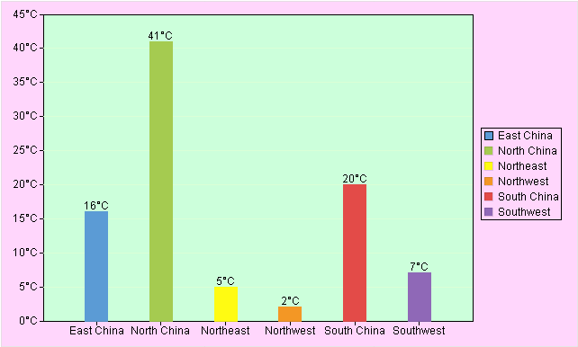
Data Displayed on Right-side of X-axis
There are four ways to mark data on the right-side of X-axis – None, Value, Name and value, and Title.
Data Format in Graph
To display data in a graph, you need to define format for the data. One example is to display temperatures in a graph, you can set data format as ##°C, as the shown in the following figure:

Bar Or Column Space
Specify spaces between columns in a column graph or bars in a bar graph.

Min Aggregate Value/Max Aggregate Value/Y-axis Label Interval
Sometimes statistical values of a graph are very large, while data differences between different categories and series are relatively small. In order to clearly mark data differences for categories and series, often a certain data area in the graph is partially enlarged. So, it is necessary to define the Minimum Aggregate Value, Max Aggregate Value and Y-axis Label Interval.
For example, there is a graph displaying the number of orders in each region. Each number falls between 1000 and 2000. Below is the graph without setting the Minimum Aggregate Value, Max Aggregate Value and Y-axis Label Interval:

If we set the Minimum Aggregate Value as 1,000, the Maximum Aggregate Value as 2,000, and Y-axis Label Interval as 100, we will plot a statistical graph as follows:

● Note: The three properties – Min Aggregate Value, Max Aggregate Value and Y-axis Label Interval- need to be set up at the same time to plot a graph in the expected way.
Y-axis Unit
You can set the unit of statistical values through Y-axis Unit. A series of options are offered, including Original Size, Auto Size, 1/1,000, 1/10,000, 1/1,000,000, and others. Below are two example graphs using different units:

Min Y-axis Tick Count
The minimum number of statistical value ticks displayed on the Y-axis.

Gridline Style
Here the gridline style refers to the style of ticks on a statistical graph. You can choose not to set the gridline style.

Space between Tile and Graph
Through this item you can set up the distance between the graph area and the graph title.

X-axis Label Interval
This item is for setting up spaces between labels on the category axis.

Other Stacked Series
Display a certain series separately in a stacked graph. Value of this property is a series name. The property is valid only when the graph type is a stacked one.

Gridline Location
Set gridline location for Category axis or Value axis, or Both, in a graph.
For Value axis:

for Both:
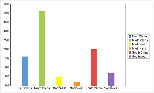
Gridline Style
The property is for setting up style of gridlines for both category axis and value axis.
Below is “Checkbox options” tab:

Highlight data points
The property lets you choose to highlight squares or points showing data positions in line graphs or not, and is valid only when the graph style is line-related. By checking this property, each category label on the line graph will be marked by a highlighted by a certain mark.
Fill color of the data points can be configured in Appearance -> Axis Color -> Column Border/Punc fill color.

Highlight trend
Whether or not to highlight the trend of changes of data positions on a line graph.

Ignore Null values
Whether or not to represent records containing null values in a graph.

Overlap data
Whether or not to display the second value or label when two neighboring values or labels overlap.

Represent dashboard values at ticks
Whether or not to plot ticks according to dashboard values.

Explode one sector of pie graph
Whether or not to explode one of the sectors of a pie graph.

Draw data table
Whether or not to plot a data table.

Center table data
Whether or not to center-align table data.

Show summary on top
Whether or not to display summaries on the top of columns.

Gradient
Whether or not to display gradient colors in a graph.

For a 3D graph, check the “Gradient” property and axis platform will be automatically plotted according to the axis line color, as the following figure shows:

Transparent
Whether or not to create transparent effect for a 3D graph.

Shadow
Whether or not to display a graph’s shadow.

Raised border
Use raised border for column-related graphs.

Discard “Other” category
See Plot graph using the first N records.
Draw dashboard ticks at the ends of colored arcs
Whether or not to place dashboard ticks at the ends of colored arcs.
When using a dashboard to display temperatures, you cannot check this checkbox because the division of temperatures is usually a range of values, rather than a fixed value. For example, -10 degrees is severely cold and 10 degrees is cold, then when using a range between the two, -10 degrees to 0 degrees represents severely cold and 0 degrees to 10 degrees represents cold.

Coincident origins
Whether or not to plot a graph beginning from the origin.
Warning Line
You can set warning line for a column graph/line graph. When a statistical value is equivalent to or greater than the specified warning value, a warning line will be marked in the graph according to the defined color and line style. Click “Add” button on the “Warning Line” group box to add a warning line, for which you can set a series of properties, including Name, Warning value, Type, Color, Thickness and Display warning value. For instance, we define a warning line and when the statistical value is 10 or above, the value will be marked by a red line.

Below is preview effect:

Appearance
Switch to “Appearance” tab on the “Graph Properties” interface, as shown below:

Canvas Color
Set the background color of the whole canvas.

Graph BackColor
Set the background color of the graph area.

Axis Color
Set colors and lengths of graph axes, legend borders, column borders and pie chart guide line. Through configuring column border color, you an set fill color for data points in a line graph; the default fill color is transparent.


Gridline Color
Set color for the gridline. The property is valid only when gridlines are displayed.

●Excel supports 256 colors while ReportLite supports any colors. So, certain colors do not have counterparts when outputting the graph to Excel. In that case, the system will find the closest replacement in Excel.
Legend Position
Set the position of legends in a graph. There are five choices – Top, Bottom, Left, Right and None.

Always draw legend by series
Generally, legends are plotted according to series. When there is only one series and you select this option, the legend will still be plotted according to the series; without selecting this option, legends will be plotted according to the category axis.


Vertical/Horizontal Space between Legends
Set vertical and horizontal space between legends and change it as needed.


Preset Colors
Select color palette for a graph. You can directly use the palette ReportLite offers or change the existing palette or define a new one through “Tools -> Color Scheme”.
Left Margin/Right Margin/Top Margin/Bottom Margin
Set location of the graph on the canvas.

Tick Length
Set length of ticks on axes.

3D Width
Set percentage between 3D axis width and series width.

Category Space
Set percentage between category space and series width.

Spaces between Series
Set percentage between series space and series depth.

Pie Rotation
Set percentage between Y-axis length and X-axis length in a pie chart.

Pie Height
Set Percentage between pie height and radius.

Font Settings
Set a series of properties under this item, including font, font color, font size, rotate angle, and so on for text in graph/X-axis/Y-axis titles and labels. To use the Chinese fonts under a non-Chinese OS, you need to install the corresponding installer. If the OS doesn’t support a certain font, the graph cannot be output as expected.
Other
Switch “Other” tab on the “Graph Properties” interface, as shown below:

Bar Height
Set height of status bars in a run graph or a Gantt graph.

Time Unit
Set Unit of the time scales in a run graph or a Gantt graph, including Year, Month, Day, Hour, Minute and Second.

Time Series Value
Under this property, you can set Begin Value, End Value, Sample Interval, Sample Unit, Label Interval and Label Unit for values on the horizontal axis in a run graph. Values of Sample Unit and Label Unit can be Year, Month, Day, Hour, Minute or Second.

Background
Set the background image for a graph.
Note: You need
to set both “Canvas Color” and “Graph Backcolor” as “Transparent” ( ) to
make the background image visible.
) to
make the background image visible.
Configuration Type
The configuration type of a background image can be a URL or an Expression. If the background image used for a graph in a report is an image file, choose the “URL “configuration type; if the background image is represented by a byte array returned by an expression, choose the “Expression” configuration type.
Mode
There are three modes for a background image – Top left, Fill and Tile.
URL/Expression
A URL can be an absolute path or a relative path. A relative path is relative to Tools -> Options -> File -> Resource directory. The property corresponds to the path in “home” property under “Report” in configuration file raqsoftConfig.xml. A relative path does not need to be preceded by a slash “/”.
Result of computing an “Expression” should be image, such as the binary streams.
Curve Type
Set the type of curve under plotting, including Lagrange, Akima and Cubic Spline Interpolation.

Barcode
This menu item helps you define barcode quickly. Barcode is a special representation of numbers, letters and certain symbols. It is a symbol of combination of bars and spaces with different widths and reflectivity according to certain coding rules to represent a complete piece of data.
Select a cell in which you want to create a barcode and click Report -> Barcode or Right-click menu -> Barcode to get the “Barcode Properties” interface. In this interface, you can configure properties as needed, as shown below:

After finishing the settings, click “OK” button to insert barcode to the cell.
Type
There are 14 code types for barcodes, including Code 39, Code 93, Code 128 Auto, Code 128 A, Code 128 B, Code 128 C, CodaBar, DataMatrix, Ean 13, Ean 8, ITF, UPCA, UPCE, and QR Code.
1. Code 39: Code 39 is a distributed barcode that can be scanned bidirectionally. It supports English and numeric representations. The biggest advantage is that there is no mandatory limit on the number of represented digits. It can use uppercase English alphabet code. The checksum can be ignored and the length can be changed. Usually, it uses "*" as the start and end character. Currently Code 39 is commonly used in industry, books, and ticket automation management.
2. Code 128: Code 128 represents high-density data. The string can become longer, and the code contains a checksum. This type of barcode has four different versions: A, B, C, and Auto.
Code 128 A: It contains all uppercase letters, numeric characters, control characters (characters whose ASCII code is 00-95), and seven special characters.
Code 128 B: It contains all uppercase letters, numeric characters, lowercase letters (characters whose ASCII code is 32-127), and seven special characters.
Code 128 C: It contains one hundred numbers (00-99) and three special characters. This version uses one symbolic character to represent a two-digit number. The end character is always :Stop.
Code 128 Auto: Automatically select a version among Code 128 A, Code 128 B and Code 128 C according to data content, and encode the graph in the shortest way.
Generally, if barcode content consists of uppercase English letters, Code 128 A and Code 128 B have same effect; if the barcode is composed of both uppercase and lowercase letters, Code 128 B is needed; if the barcode is made up of pure numbers, Code 128 C is needed. Code 128 is commonly used in industry, warehousing, and retail and wholesale.
3. CodaBar: CodaBar is a continuous, self-check, numeric-only barcode whose length can be changed. The barcode content consists of 21 characters, 10 numbers (0~9), 7 special characters (.)"+","-", "*" ,"/" ,"$","." ,":") plus 4 English letters A, B, C, D. The English letters are only used as the start and end characters. This type of barcode is commonly used in warehousing, blood banks and air express.
4. DataMatrix is a matrix two-dimensional barcode, the smallest size of which is the smallest among all barcodes at present, and can be divided into two types: ECC000-140 and ECC200. The codable character set includes all ASCII characters and extended ASCII characters, a total of 256 characters; the barcode size (excluding blank areas) is 10×10~144×144; the data capacity is 235 pieces of alphanumeric data, 1556 pieces of 8-bit metadata, 3116 pieces of digital data. This type of barcode is commonly used in electronics, retail and government.
5. Ean13: EAN13 is a common barcode protocol and standard for general terminal products. The standard code has a total of 13 digits, including 3-digit “country code, 4-bit “vendor code”, 5-bit “product code” and 1-bit “correction code”. It is mainly used in supermarkets and other retail industries.
6. Ean8: The short EAN code has a total of 8 digits, including 2-digit “country code”, 5-digit “product code” and 1-digit “correction code”. When the packaging area is less than 120 square centimeters and the standard size cannot be used, you can apply for the shortened size.
7. UPCA: UPCA is the earliest barcode applied on a large scale. It is characterized by fixed length and continuity. UPCA can only be used to represent numbers, so it only supports numbers 0-9, and has a 1-digit verification code. It is the predecessor of EAN barcode. UPC only provides digital encoding, allows the number of digits up to 12 at most, and needs verification code. The main application scenarios of UPCA are supermarkets and department stores.
8. QRCode: QRCode is a square matrix two-dimensional code symbol. It has the advantages the one-dimensional barcode and other two-dimensional barcodes have, such as large information capacity, high reliability, being able to represent Chinese characters, image and various other text information, and high security and strong anti-counterfeiting abilities.
9. Code93: Code93 is a variable-length continuous alphanumeric code system. It supports 44 types of character sets, ten numbers (0-9), twenty-six uppercase English letters(A-Z), and eight special characters (“space character”, “-”, “.”, “*”, “$”, “/”, “+” and “%”). The character sets it supports is the same as those supported by Code 39. However, Code 93 uses double-check characters, and has higher density and security than Code 39. Therefore, in the case of insufficient area, Code 93 code can take place of Code 39.
10. ITF: ITF barcode, also known as “Interleaved 2 of 5” barcode, is mainly used for transportation and packaging. It is used when printing conditions are poor and EAN-13 and UPC-A barcodes are not allowed to be printed. The ITF barcode is continuous, fixed-length, self-checking, and bidirectional with both bars and spaces indicating information. ITF-14 barcode has same character set and character composition as the “Interleaved 2 of 5”. It consists of a rectangular protection frame, a blank area on the left, barcode characters, and a blank area on the right.
11. UPCE: The UPCE barcode symbology has same height as the UPCA, but is much shorter in length. UPCE is a simplified form of UPCA. Its encoding method is to compress the UPCA code into a short code for ease of use. Therefore, its encoding form must be converted from UPCA code.
Format
A barcode is an image. You can set the image format through this property – JPG, GIF or PNG. A JPG format image has blurred edge. A GIF format image has sharp edge and supports only 256 colors. The edge of a PNG format image is between that of JPG and that of GIF, and has the most ideal effect.

Charset
Set character set for the barcode content. There are 3 types of character sets – UTF-8, GBK and iso-8859-1.
Logo source, Logo value/expression, and Logo Ratio
The logo is only valid for a QRCode (two-dimensional code). You can add an image to two-dimensional code.

“Logo source” can be a URL path or an expression.
When a logo source is a URL path, the “Logo value” is path of the image file. When it is represented by an expression, the result of computing “Logo expression” should be an image, such as a binary stream.
“Logo Ratio” is for setting the displayed size of the inserted image.
Error elimination rate
The error elimination rate refers to the ability of the QRCode icon to be scanned even after part of it is covered. The higher the error correction rate, the bigger part of the QRCode image can be blocked.
The QRCode error elimination rate is represented by English letters. There are 4 levels – L, M, Q and H:
L 7%
M 15%
Q 25%
H 30%
Font Name
Set font for the note characters in a barcode.
Font Size
Set font size for the note characters in a barcode.
Show Data
Whether or not to display the note characters in a barcode.
Horizontal alignment
Set the text alignment style for the note characters in a barcode.
Rotate Angle
Set the angle of rotating the barcode counterclockwise.
Data
Data a barcode represents.
Note:
The “Data” property is the core of barcode. If no values are set, the barcode becomes meaningless. The “Data” value can be constant, cell, parameter, or an expression containing cells or parameters. If the value is a cell, parameter or an expression containing cells or parameters, they must be preceded by the equals sign, such as =A2.
Expression
Through this item you can edit property value or value expression for a selected cell.
Select a cell for which an expression will be configured, click Report -> Expression or through Right-click menu -> Expression, or press shortcut key Ctrl+E, or double-click the cell to open “Expression Editor” interface, as shown below:

To edit the property value, just enter a desired one in the above interface, then click “OK” button.
To edit an expresion, select the “Expression” radio button and you get the following interface:

Enter an expression in the “Report Expression” edit zone. The expression can use the system-defined data set, parameters, and built-in functions and operators. Constants are used to get code values in the report properties drop-down list. After editing the expression, click “OK” button.
About whether or not to precede an expression with the equals sign, see Important things about defining a report expression.
Subreport
This item allows you to define a subreport quickly.
Concept of the subreport:
Often a report is made up of multiple subreports in business logics. These subreports and the master report may or may not have associations. We call such a report the composite report.
In ReportLite, we call a report consisting of multiple reports the master report, and each of the multiple reports the sub report. A subreport is always located in a certain cell, which can be a merged cell.
A subreport can also be a composite report. So, a subreport can be endlessly nested.
Define a subreport
Select a cell to which a subreport will be inserted, click Report -> Subreport or through Right-click menu -> Subreport to get into “Subreport Cell Properties” interface.

Click “Define Subreport” button to pop up the following “Report Properties” interface:

Click “Add” button to add a subreport to the subreport list box, and edit the subreport name and URL, as shown below:

You can define multiple subreports. After finishing subreport edit, click “OK” button in the above screenshot to go back to the “Subreport Cell Properties” interface, as figure 1.4.11.2-1 shows.
In the “Please Select Subreport” dropdown list, select the name of subreport to be inserted in the selected cell.
Select a “Type” – Embedded or Imported.
Click “Add” button to add parameters to the report as needed. Edit parameter name under “Parameter” column in the parameter list (Note: the parameter should be already defined for the subreport). Edit the parameter’s value expression in the master report under “Expression” column in the parameter list. Select a parameter in the parameter list and click “Delete” button to remove the parameter. Click “Reset” button to delete all parameters from the list for reediting. When all settings are done, click “OK” button to insert the subreport to the selected cell. Below is the result:

Subreport’s insert type
There are two insert types – Embedded and Imported.
Embedded
An embedded master-sub report features one or more embedded subreports in a cell/cells, forming a layout where one or more cells in a report are embedded with subreport(s). Gridlines of a subreport and those of the master report are allowed to be unaligned, and gridlines of different subrepots can also be unaligned. An embedded subreport will become an independent report after it is expanded, so the source cell accommodating the subreport should be kept so that the master report can access values of the subreport.

Imported
With an imported subreport, cells of the master report will expand bidirectionally according to the number of rows and columns in the subreport. The row count and column count in the subreport determine the number of rows and columns the master report to be expanded for the master report. A subreport uses the blank rows and columns in the master report, and has strictly aligned gridlines. When an imported subreport is expanded, it forms a two-dimensional rectangular cell unified within the master report. In this case, the source cell of the subreport won’t be retained and the master report can’t access values in the subreport.

Date Type
Through this item you can set data type and value for a cell.
Select a cell, click Report -> Data Type or through Right-click menu -> Data Type to get into the following “Cell Data Type” interface:

● Cell data type: Normal Cell, HTML and Rich Text.
Normal Cell
Text is the default and the most common data type a report cell uses. When a cell format is “Text”, the system will treat characters, numbers or results of computing an expression in a cell as text to handle.
HTML
HTML refers to Hypertext Markup Language. An HTML file includes not only the text content, but also some markers. If the report needs to use certain markers and the cell do not support them, you can set cell format as HTML to embed HTML markers in the cell. The HTML type enables to display the marker information in a cell it does not support. You can also use HTML to embed a hidden JavaScript function in a cell. When a report uses a same JS function in multiple places, we can set a hidden cell as HTML type and define a JS function in this cell for being referenced in the other cells. This makes report making become very convenient.
● Example: Insert HTML map marker in the report.
1. Select a cell for which the cell format will be set as HTML, and click Report -> Data Type or through Right-click menu -> Data Type to get into the “Cell Data Type” interface. Select HTML:

2. Enter the HTML marker in the “Content” box, as the above screenshot shows:
3. Click “OK” button and preview the inserted HTML marker as follows:

● Example: Insert HTML img marker in the report.
1. Select a cell for which the cell format will be set as HTML, and click Report -> Data Type or through Right-click menu -> Data Type to get into the “Cell Data Type” interface. Select HTML:

2. Click “OK” button and preview the inserted HTML marker as follows:

Rich Text
The rich text format is similar to HTML, but it only supports font-related property settings. Below uses of the rich text format:
1. Support HTML syntax
Rich text supports following HTML tags:
ⅰ. Font tag: <font></font>, which includes various font properties – face, color, size. All properties can be used in the same tag.
Note: The “Font” in a rich text tag cannot be defined freely. It specifies the font size on a website, whose range is 5.5pt ~ 26pt (the actual font size is 8pt ~36pt).
ⅱ. Bold tag: <b></b>, which makes the tag text bold.
ⅲ. Italic tag: <i></i>, which makes the tag text italic.
ⅳ. Underline tag: <u></u>, which underlines the tag text.
ⅴ. Superscript tag: <sup></sup>, which converts tag text to the superscript.
ⅵ. Subscript tag: <sub></sub> which converts tag text to the subscript.
ⅶ. Paragraph tag: <p></p>, which species that text in the tag is a separate paragraph, for which you can set the space between all lines of the text.
Note: The paragraph tag does not support exporting the text to Word or Excel.
ⅷ. Strikethrough tag: <del></del>, which adds strikethroughs to the tag text.
Besides, in an ambiguous case, characters such as “<” and “&” are needed, as HTML does. Examples are “>” and “&”, like HTML
2. Support Style
Rich text supports certain styles used in the font tag. It supports following style properties, including font-family, color, font-size, font-weight:bold/ font-weight:normal, font-style:italic/ font-style:normal, and text-decoration:underline/ text-decoration:none. You can use one or multiple properties in one style.
The code in a rich text format cell must conform with HTML syntax. When the rich text format content exceeds the cell, the part beyond limits won’t be displayed at preview and printing.
● Example: Use rich text format superscript and subscript in solid lines in the report.
1. Select a cell for which the cell format will be set as HTML, and click Report -> Data Type or through Right-click menu -> Data Type to get into the “Cell Data Type” interface. Select Rich Text:

2. Enter the rich text content in the “Content” box, as the above screenshot shows:
3. Save the report and click “Preview” button to view the result:
● Example: Use tag <p></p> in the rich text
Set rich text format for cell A2 without using the <p></p> tag. Set rich text format for cell B2 and use <p></p> tag on it. Compare the two cells and we find that the line spacings specified in the two <p></p> tags are different.
1. Select a cell for which the cell format will be set as HTML, and click Report -> Data Type or through Right-click menu -> Data Type to get into the “Cell Data Type” interface. Select Rich Text and the set the cell content as follows:

Here you can specify row height using HTML font size and px, such as <p style="line-height:2"></p>;<p style="line-height:20px"></p>. When using <br>, the “Auto-wrap Text” property should be checked.
2. Click “Preview” button in IDE and the effect is as follows:

Image
This item lets you set image for a cell.
Select a cell, and click Report -> Image or through Right-click menu -> Image to get into the following “Image” interface:

● Image Type: Image file, Expression and Custom.
Image file
The cell format is an image, which can be any image file. The cell’s value expression is the image file’s URL.
● Example: Insert an image file in a report.
1. Select a cell to which an image will be inserted, and click Report -> Image or through Right-click menu -> Image to get into the following “Image” interface. Select “Image file”:
2. Edit the image file’s URL in “Please select the image file” box. Click “Select” button to get “Open” dialog box, and select the image file path or enter the path directly in the “Please select the image file” box, as the following screenshot shows:

3. Click “OK” button and preview the inserted image as follows:

Expression
Enter an expression in “Expression” box. The expression’s result must be an image, such as a binary stream. In the expression you can use the system-defined data sets and parameters as well as the built-in functions and operations. After the expression editing is done, click “OK” to button.
Custom
The “SPL File” source is supported for custom images.
SPL File

Reference the plotting algorithm that a .splx/.spl/.dfx file generates by invoking the esProc file. Parameters defined in the SPL file will be automatically listed in the parameter list. Below is a .splx file:

A SPL file supports both the absolute path and the relative path. The latter is relative to the class path and the Search path configured in Esproc options.
Image Layer
Concept:
An image layer is used to create e-signature, watermark in a cell, electronic seal, and the other functions.
Below is the effect:

Properties
There are seven properties for the image layer – Display, Configuration Type, Image Layer Width, Image Layer Height, Horizontal Alignment, Vertical Alignment, and URL/Expression.

Display
Select a display type for the image layer – Foreground and Background.
An image layer can be a background picture, achieving an effect of editing words on an image file.
Or it can be a foreground picture, which will cover the cell content.
Configuration Type
There are two configuration types – URL and Expression. If the image layer in a report comes from an image file, select “URL” image source; if the image layer needs to return an image according to an expression, select “Expression” image source.
Image Layer Width
Set width for an imager layer. Unit is px.
When both width and height of an image layer are 0, the image is displayed as the original size.
When image width is 0 but image height isn’t, use the image height as the new size to compute the image width according to aspect ratio.
Image Layer Height
Set height for an imager layer. Unit is px.
When both width and height of an image layer are 0, the image is displayed as the original size.
When image height is 0 but image width isn’t, use the image width as the new size to compute the image height according to aspect ratio.
Horizontal Alignment
Set the image layer alignment mode in the horizontal direction – Follow above by default, Left, Center and Right.
Vertical Alignment
Set the image layer alignment mode in the vertical direction – Follow above by default, Top, Center and Bottom.
URL/Expression
URL/Expression: Correspond to “Configuration Type”. Result of computing an expression must be an image, such as a binary stream. An “URL” can be an absolute path or a relative path; you can set a URL as an HTTP path.
A relative path is relative to the path configured in “Tools -> Options -> File -> Resource directory”.
You can write an expression to compose an image file path dynamically, such as ="D:/report/"+arg1.
Note: The path separator in the expression can be slash “/” or backslash “\”. As a backslash “\” is treated as an escape character within a quotation mark, they need to written as “\\” to be normally output, such as if(arg1==1,"D:\\report\\p1.jpg","D:\\report\\p2.jpg").
To remove an existing image layer, click Edit -> Clear -> Clear Image Layer or through Right-click menu -> Clear Image Layer.
Application
● Example 1: Create an e-signature.
To create an e-signature for a report, you can configure the image layer in the selected cell. Below is how to do this:
1. Make a report:

2. Select D5, click Right-click menu -> Imager Layer, and set display type as background and image layer source as URL, as the following shows:

3. Click “OK” to get the following preview effect:

● Example 2: Create the watermark effect.
In order to make a neat report, sometimes we need to create watermarks in certain cells. And we can use Image Layer functionality to achieve this according to following directions:
1. First, make a report;

2. Then, set image layer for the cell where you need to display the watermark;
Select A10, right-click the cell and then Image Layer, and choose display type as background. Below are settings:

3. After all this, we have the following preview effect:

● Example 3: Create an electronic seal.
When trying to create an electronic seal, the original seal image is probably bigger than the cell that will contain the image layer. In such a case, the seal will exceed the limits of the cell. On the other hand, it is required that the seal be displayed in its original size without affecting the display of text in the cells around it. To achieve this, we need to set “Resize Mode” for the cell holding the seal as “Resize according to content”.
1. Make a contract report:

2. Select cell D17, select Right-click menu -> Image Layer, set “Display Type” as background, and click “OK” button. The settings are as follows:

3. Set “Resize Mode” for D17 as “Resize according to content”, as the following screenshot shows:

4. After all this is done, you have the following preview effect:

Set Password
Set password for a report through this item.
Click Report -> Set Password on the menu and open the following “Set Password” interface:

Original password
By default, the original password is gray and uneditable. It becomes editable only when resetting or deleting the password.
New password
Set a new password for a report.
Confirm new password
Confirm the new password and make sure the password entered the second time is the same the previous time. When trying to delete a password, “Confirm new password” can be left empty.
Report Group Configuration
This item lets you configure properties of report group.
First, add report sources to a report group. The concept of report source to a report group is similar to the concept of data set to a report.
Click File -> New Report Group, or click Report -> Report Group Configuration when opening a report group, or select a report group and right-click Report Group Configuration to open the “Report source editor” interface, choose the target page and set up properties for the report group. Below is the “Report source editor” interface:

Report Source:
Select “Report Source” page on the “Report source editor” window to configure basic properties of the report source:

Name
Define name for the report source.
URL type
Set URL type of the report in the report source. There are two types – relative path and absolute path.
1. Relative path
The relative path is relative to the “Resource directory” in Tools -> Options -> File.
A relative path does not need to be headed by the slash “/”; but an absolute path should begin by the drive letter or the slash “/”. An absolute path preceded by the slash “/” implies the root directory of the current drive. For example, an application’s root directory is D drive, then /reportFiles means D:/ reportFiles.
2. Absolute path
An absolute path is the real path of a report in the hard disk. Select “Absolute path” under “URL type”, double-click the “URL” edit box and the following “Open” dialog pops up:

Choose location of a report, click “Open” button and the report’s absolute path will be automatically entered in the “URL” edit box.
URL
The URL path of a specified report, which can be a relative path or an absolute path in the format of F:/Raqreportlite/reportlite/demo/files/Orders.rptx or files/Orders.rptx.
Click “Add” button to add a report source, for which you can edit name, URL type, URL and other properties. Select a report source in the report source list and click “Delete” button to delete it. Then Click “OK” button to save the editing.
Options:
Switch to “Options” page on the “Edit Report Source” interface to configure basic properties of the report group, as shown below:

Independent reports
Set up whether each report in the report group is independent or not. When the option is checked, reports are independent of each other and each is computed by the buffer manager and the result is buffered; when the option isn’t checked, all reports are computed by the report group engine, and the listener is invoked to buffer the results to the buffer manager.
Compute reports continuously
This option lets you set up whether or not to compute all reports continuously. When it is checked, reports in the report group will be computed front to back in order even when there is page break and page numbers will remain continuous. The option and the “Independent reports” option are mutually exclusive.