Coordinate Axes
Coordinate Systems and Transformation discussed the relation between logical axes and physical axes, as well as how to position coordinate axes on the canvas and then plot a chart element, during chart plotting with esProc. esProc provides a variety of logical axes for plotting different styles of charts. Different types of logical axes require different settings to perform coordinate transformation correctly. The main purpose of defining the logical axes is to convert the logical coordinates on the chart elements to the physical coordinates for plotting a chart. The positioning of a chart element will not be affected whether the logical axes are actually plotted or not.
12.3.1 Numeric axis
Numeric axes are required when plotting a chart showing relative sizes of numeric data. Through them the numeric statistical values are transformed to physical coordinates. The numeric axis is so widely used that it appears in almost all charts as well as is used for a function graph.
Through the numeric axes you can calculate the position of coordinate values on the canvas according to their specified value ranges. Below is a plotting algorithm for a function graph:
|
|
A |
|
1 |
=canvas() |
|
2 |
=A1.plot("BackGround") |
|
3 |
41 |
|
4 |
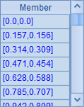
=A3.([round(pi(2*#-2)/(A3-1),3),round(sin(pi(2*#-2)/(A3-1)),3)]) |
|
5 |
=A1.plot("NumericAxis","name":"x","autoCalcValueRange":false, "maxValue":7.0,"scaleNum":7,"xPosition":0.45) |
|
6 |
=A1.plot("NumericAxis","name":"y","location":2,"autoCalcValueRange": false,"maxValue":1.0,"minValue":-1.0,"scaleNum":4) |
|
7 |
=A1.plot("Line","markerStyle":0,"axis1":"x","data1":A4.(~(1)),"axis2":"y", "data2":A4.(~(2))) |
|
8 |
=A1.draw@p(350,200) |
The plotting algorithm plots a line chart fitting onto a sine curve. A3 specifies the sample number during a period. A4 prepares the chart-specific data, as shown below:
A5 plots the x-axis, specifying a range of values from the default minimum 0 to the maximum 7 and placing it in the middle of the y-axis. A6 plots the y-axis, specifying the value range as -1<=y<=1. A7 plots a line chart whose logical coordinates come from A4’s data. Below is the plotting result:
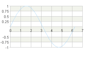
Thus by defining the numeric axes, you can plot the chart according to the calculated numeric values. On a numeric axis, the logical coordinate values are evenly graduated, consecutive numbers. So a numeric axis is a continuous axis.
The length of a numeric axis is determined by the logical coordinates of the specified start point and end point of the axis. The actual position of a certain pair of coordinate values can be calculated based on the value ranges of the horizontal and vertical numeric axes (they are defined by a minimum value and a maximum value). With esProc, this coordinate transformation calculation is done automatically. Users just need to define the coordinate axes appropriately in the plotting algorithm.
By default the Autocalc value range property of the numeric axis is true. In this case the value range of a numeric axis will be automatically set according to the chart element for which the axis is plotted. If the automatically generated axis cannot meet the requirement, users can specify its value range and the number of graduations as in this example.
12.3.2 Date axis
A date axis is similar to a numeric axis. But its logical coordinates are date/time data, not numeric values. A date axis is commonly used to plot charts like tendency chart, run chart, etc.
Below is the plotting algorithm of a stock trend chart:
|
|
A |
|
1 |
=canvas() |
|
2 |
=demo.query("select * from STOCKRECORDS where STOCKID='002242'") |
|
3 |
=A1.plot("BackGround") |
|
4 |
=A1.plot("DateAxis","name":"x","format":"dd/M","displayStep":20) |
|
5 |
=A1.plot("NumericAxis","name":"y","location":2,"autoCalcValueRange": false,"maxValue":50.0) |
|
6 |
=A1.plot("Line","markerWeight":2,"axis1":"x","data1":A2.(DATE),"axis2": "y","data2":A2.(CLOSING)) |
|
7 |
=A1.draw@p(450,250) |
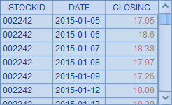
In which A2 retrieves data for plotting the chart from the database:
A3 plots a white background. A4 plots x-axis as the date axis, calculating value range automatically and only displaying trade dates on the graduation labels. A5 plots y-axis as the numeric axis with the maximum value being 50. A6 plots a trend line using logical coordinates including trade dates and closing stock prices. Here’s A7’s plotting result:
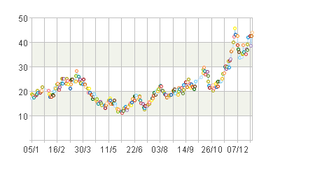
From the above chart you can notice that data points are only plotted on trade dates when the statistical data is available. The date axis is also a continuous axis, just like the numeric axis.
12.3.3 Enumeration axis
An enumeration axis is used in plotting a chart comparing data of various categories, or of different series. A chart can be positioned according to the categories/series on an enumeration axis. Unlike a numeric axis, coordinate values on an enumeration axis are inconsecutive.
A sequence of names of all categories or series should be specified during plotting an enumeration axis in order to calculate physical coordinates from values of a certain category or series.
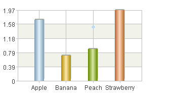
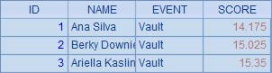
Below is the algorithm of plotting a column chart comparing unit prices of fruits:
|
|
A |
|
1 |
=canvas() |
|
2 |
=demo.query("select * from FRUITS") |
|
3 |
=A1.plot("BackGround") |
|
4 |
=A1.plot("EnumAxis","name":"x","categories":A2.(NAME)) |
|
5 |
=A1.plot("NumericAxis","name":"y","location":2) |
|
6 |
=A1.plot("Column","axis1":"x","data1":A2.(NAME),"axis2":"y","data2": A2.(UNITPRICE)) |
|
7 |
|
|
8 |
=A1.draw@p(350,200) |
A2 retrieves data for plotting the chart from the database:
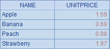
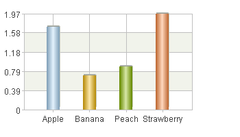
A3 plots a white background. A4 sets x-axis as the enumeration axis and defines a sequence of categories, which is a sequence of fruit names. A5 sets y-axis as the numeric axis and calculates value range automatically. A6 plots the column chart according to logical coordinates composed of fruit name and unit price. A8’s plotting result is as follows:
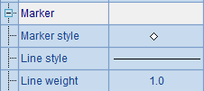
To demonstrate the transformation of coordinates on the enumeration axis more clearly, enter code (=A1.plot("Dot","markerStyle":6,"axis1":"x","data1":"Peach","axis2":"y","data2":"1.5")) in A7 to plot a dot, whose properties are set as follows:
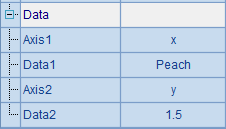
Below is the plotting result in which position of the point ["Peach",1.5] can be seen:
If the categories and series on the enumeration axis aren’t specified, the data would be analyzed automatically based on the chart element for which the enumeration axis was plotted.
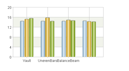
An enumeration axis can hold both categories and series together, like the following plotting algorithm of a gymnastic scores chart:
|
|
A |
|
1 |
=canvas() |
|
2 |
=demo.query("select * from GYMSCORE") |
|
3 |
=A1.plot("BackGround") |
|
4 |
=A1.plot("EnumAxis","name":"x") |
|
5 |
=A1.plot("NumericAxis","name":"y","location":2) |
|
6 |
=A1.plot("Column","axis1":"x","data1":A2.(EVENT+","+NAME),"axis2":"y","data2":A2.(SCORE)) |
|
7 |
|
|
8 |
=A1.draw@p(450,250) |
A2 retrieves data for plotting the chart from the database:
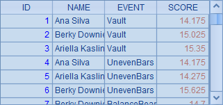
A3 plots a white background. A4 sets x-axis as the enumeration axis and analyzes data automatically; A5 sets y-axis as the numeric axis. A6 plots the column chart. When using categories and series together, the logical coordinate on the enumeration axis should include both the category value and series value separated by a comma, like "Vault, Becky Downie".
Plotting result of A8 is as follows:
12.3.4 Polar axis and radial axis in the polar coordinate system
A polar or a radial axis in a polar coordinate system can be a numeric axis, an enumeration axis or a date axis too. But the properties of the logical axes are different from those of the logical axes in a Cartesian coordinate system.
Below is a plotting algorithm of a vault scores pie chart:
|
|
A |
|
1 |
=canvas() |
|
2 |
=demo.query("select * from GYMSCORE where EVENT = 'Vault'") |
|
3 |
=A1.plot("BackGround") |
|
4 |
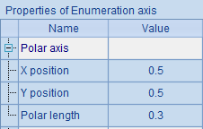
=A1.plot("EnumAxis","name":"x","location":3,"polarX":0.5,"allowLabels":false) |
|
5 |
=A1.plot("NumericAxis","name":"y","location":4,"allowLabels":false) |
|
6 |
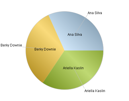
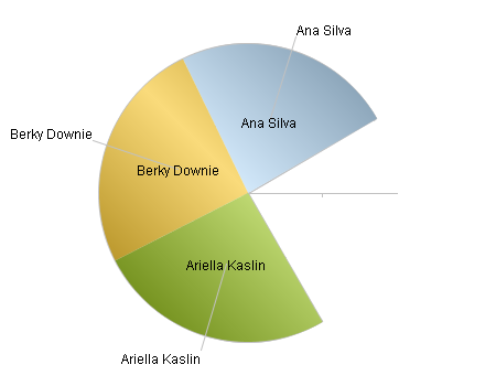
=A1.plot("Sector","text":A2.(NAME),"axis1":"x","data1":A2.(NAME), "axis2":"y","data2":A2.(SCORE)) |
|
7 |
=A1.draw@p(450,350) |
A2 retrieves data for plotting the chart from the database:
A4 sets polar axis x as an enumeration axis, specifying that labels won’t be displayed and defining its physical abscissa as 0.5 to plot the pole in the middle of the canvas. A5 plots radial axis y as a numeric axis, displaying no labels and using default property values of the radial axis.
A6 plots the pie chart according to logical coordinates composed of athlete names and scores, labelling athlete name to each slice. A7’s plotting result is as follows:
As can be seen from the polar axis settings, its length, i.e. the radius of the polar coordinate system, is set in proportion to the canvas width.
Modify the start angle and end angle properteis of the polar axis by changing A5’s code to =A1.plot("NumericAxis","name":"y","location":4,"startAngle":30,"endAngle":300,"allowLabels":false):
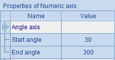
With this re-setting, the scope of the coordinate plane has changed. Plotting result is as follows:
12.3.5 Legends
Legends are an important part of a chart. It explains the colors and symbols in the chart. A legend entry consists of a color/symbol and its descriptive text, but it is inconvenient to be positioned according to the logical coordinates on x-axis and y-axis. In this sense, a legend can be regarded as a special logical axis.
The plotting algorithm below adds a legend to the column chart showing the unit prices of fruits plotted in Enumeration axis:
|
|
A |
|
1 |
=canvas() |
|
2 |
=demo.query("select * from FRUITS") |
|
3 |
=A1.plot("BackGround") |
|
4 |
=A1.plot("EnumAxis","name":"x","categories":A2.(NAME)) |
|
5 |
=A1.plot("NumericAxis","name":"y","location":2) |
|
6 |
=A1.plot("Column","axis1":"x","data1":A2.(NAME),"axis2":"y","data2": A2.(UNITPRICE)) |
|
7 |
=A1.plot("Legend","legendText":A2.(NAME),"x":0.81,"y":0.2,"width":0.18) |
|
8 |
=A1.draw@p(350,200) |
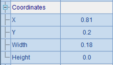
A7 plots the legend element by setting its properties and position:

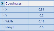
Setting coordinates of a legend is similar to setting those on a logical axis. X and Y together specify the physical coordinates of the top left point of the legend. Note that the legend will adjust itself automatically as needed if either of its Width and Height properties is set as 0, as shown in the above.
According to the properties set above, the plotting result is like this:
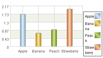
As can be seen from the finished chart, when the text of a legend entry cannot fit within the specified width, it will be automatically wrapped onto the next line. The colors of legend entries will be generated automatically if they aren’t specified. But they can be properly displayed as long as the column colors are also generated automatically and the columns are arranged in the same order as the legend entries.
But what if the columns and legend entries are not in the same order, and/or the chart has a enumeration axis with multiple categories and series? The following example adds a legend to the clustered column chart of gymnastic scores:
|
|
A |
|
1 |
=canvas() |
|
2 |
=demo.query("select * from GYMSCORE") |
|
3 |
=A1.plot("BackGround") |
|
4 |
=A1.plot("EnumAxis","name":"x") |
|
5 |
=A1.plot("NumericAxis","name":"y","location":2) |
|
6 |
=A1.plot("Column","axis1":"x","data1":A2.(EVENT+","+NAME),"axis2":"y","data2":A2.(SCORE)) |
|
7 |
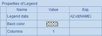
=A1.plot("Legend","legendText":A2.id(NAME),"x":0.81,"y":0.2,"width": 0.18) |
A7 plots the legend element by setting its properties and position:
Plotting result is as follows:
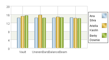
Here is a problem. The athlete names in the legend have been sorted, thus their order becomes inconsistent with the score ranking displayed in some clustered columns, i.e. the legend entries and the chart do not match. To avoid this kind of problem, data of both should be sorted in the same order. As in this example, you can modify A2’s code into =demo.query("select * from GYMSCORE order by NAME"). Then you will get the plotting result below:
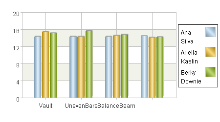
With the chart-specific data sorted by name, the legend and the chart can match each other.