The Column Element
The column element is frequently used in plotting various charts. Some illustrations have been made about it in Coordinate Axes. This part illustrates the setting of its properties and their roles.
12.7.1 Data properties
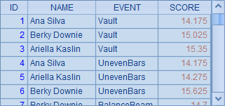
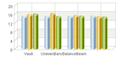
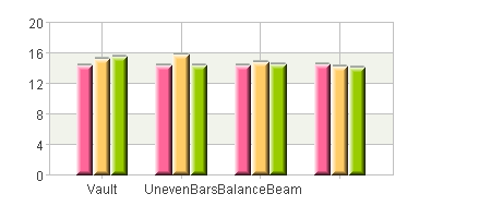
The plotting algorithm below for plotting a clustered column chart of gym results will lead you to the preliminary knowledge about how to plot a column chart:
|
|
A |
|
1 |
=canvas() |
|
2 |
=demo.query("select * from GYMSCORE") |
|
3 |
=A1.plot("BackGround") |
|
4 |
=A1.plot("EnumAxis","name":"x") |
|
5 |
=A1.plot("NumericAxis","name":"y","location":2) |
|
6 |
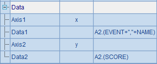
=A1.plot("Column","axis1":"x","data1":A2.(EVENT+","+NAME),"axis2":"y","data2":A2.(SCORE)) |
|
7 |
=A1.draw@p(450,200) |
A2 retrieves data for chart plotting from the database:
A3 plots a white background. A4 sets an enumeration axis as the horizontal axis x, with data analyzed automatically. A5 sets a numeric axis as the vertical axis y. The plotting algorithm does not plot any legends. A6 plots the column chart. Chart properties of the column element will be discussed later.
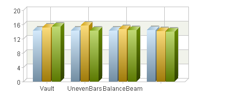
The plotting result of A7 is:
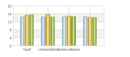
By default the fill colors of columns will be automatically generated by esProc’s default pallette.
The column element needs only one pair of coordinates at minimum to be positioned. According to its numeric axis height, a column will be plotted starting from a position on axis x to the data point. Two logical axes are required to define coordinate data, and the logical coordinates on them will be defined individually.
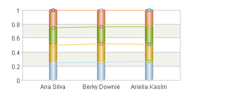
Besides using categories to represent different events, this chart also uses series to represent athletes, so the logical coordinates on the enumeration axis should contain data of both the categories and series. Values of the two types of data will be separated by a comma, such as "Vault,Becky Downie". Similar to the dot element, multiple pairs of coordinates are for plotting multiple columns.
12.7.2 Width of columns
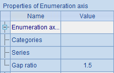
The width of columns in a column chart has a default value. No columns will be plotted wider than this value, which is determined by the number of columns and the Gap ratio property of the enumeration axis. The gap ratio is the ratio of space width between columns in different categories to the default column width. The default ratio is 1.5, which means the former is 1.5 times wider than the latter.
Note: This property of enumeration axis will affect the plotting result of the column element that uses this axis. By editing the chart parameters to modify the property in A4, you can adjust the width of columns. For example, modifying this enumeration axis property in the clustered column chart as follows:
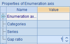
Set Gap ratio as 1 to make the space smaller and equal to the column width. The plotting result would be this after the modification:
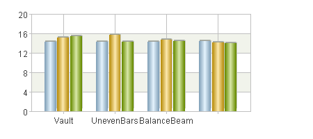
The space between different groups of columns has become smaller, making the column width comparatively bigger. Actually the default column width is collectively decided by the gap ratio on the enumeration axis as well as the number of columns and their categories.
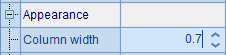
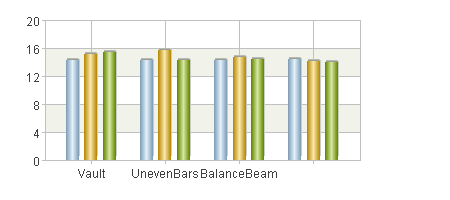
Besides the default width, the width of the column is affected by appearance properties of the column element as well, such as Column width. The value of Column width is the proportion of column width to the default width. When the value is 1, column width is equal to the default width. The default value is 0.9, meaning the ratio between the column width and the default width is 0.9. Seen from the above plotting result, columns within the same group in this case still have space between each other. If the chart properties are modified as follows:
Since the Column width value becomes smaller, the width of each column becomes smaller, with following plotting result produced:
12.7.3 Appearance properties
Like the appearance properties discussed in The Dot Element, you can set the border style and fill color for the column element too. For example, modifying A6’s chart parameters to change the column element’s properties:
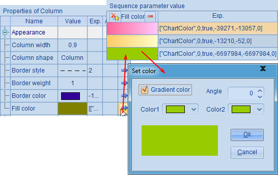
Restore column width to its default value; set border style of the column element as blue dashes and the border weight as 1. Use a sequence to set fill colors for the columns. Gradient color is checked for the 3rd fill color, but both color 1 and color 2 properties have the same setting. Then the plotting result is:
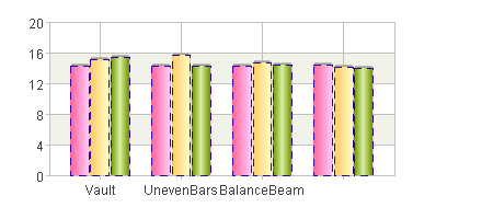
You can see that the columns’ border styles and fill colors have thus changed. The fill colors set via a sequence will be used cyclically. When the settings of Color1 and Color2 for the gradient are the same, a lighting effect will be generated automatically.
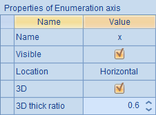
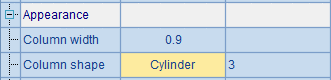
In addition to the border style and fill color and the column width talked about in the preceding section, the appearance properties of the column element also include Column shape. Besides the common bars, there are also 3D columns and cylinders, which are usually used in a 3D coordinate system.
If the 3D property of one of the axes used by the chart element is checked, the plotting will take on the 3D effect. Modify the chart properties for the enumeration axis by editing A4:
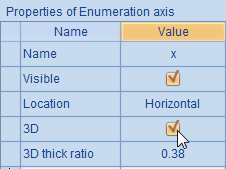
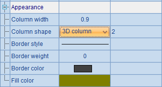
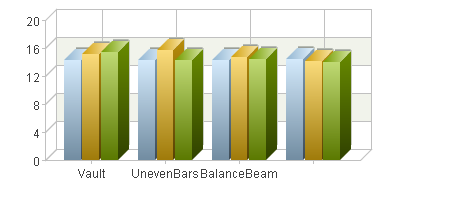
By setting the x-axis as a 3D axis, the entire coordinate system will assume the 3D effect during plotting. But, if the column shape remains the column, a two-dimensional column chart will be plotted, which is not in harmony with the 3D coordinate system. To fix this issue, modify the column shape into 3D column in A6 and restore default value for border style and fill color, as shown below:
This way, a 3D column chart is plotted:
In the chart, both the horizontal and vertical axes are three-dimensional. To adjust the thickness of the 3D chart, modify 3D’s Axis’s thickness ratio under the 3D property. Note that the thick ratio is set according to the default width mentioned in the previous section.
Now look at the plotting result and feel the change of the 3D thickness:
Or you can set a cylinder shape:
And the plotting result is:
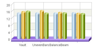
In particular, when plotting a 3D chart, if you don’t set the line style for a certain axis, then this axis will be plotted as a platform. For example, modifying A4’s parameters of line color and line style for the x-axis in the plotting algorithm:
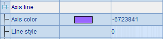
Then the plotting result is:
12.7.4 Stacked column chart
Stacked column charts stack multi-serie columns of data of the same category, instead of placing them side by side. Below is the plotting algorithm of such a chart:
|
|
A |
|
1 |
=canvas() |
|
2 |
=demo.query("select * from GYMSCORE") |
|
3 |
=A1.plot("BackGround") |
|
4 |
=A1.plot("EnumAxis","name":"x") |
|
5 |
=A1.plot("NumericAxis","name":"y","location":2) |
|
6 |
=A1.plot("Column","stackType":2,"axis1":"x","data1":A2.(NAME+","+ EVENT),"axis2":"y","data2":A2.(SCORE)) |
|
7 |
=A1.plot("Line","stackType":2,"axis1":"x","data1":A2.(NAME+","+EVENT), "axis2":"y","data2":A2.(SCORE)) |
|
8 |
=A1.draw@p(450,200) |
You can also make a stacked line chart by plotting line elements, whose properties are similar to those of the column element. This plotting algorithm plots both a column chart and a polyline chart. Different from preceding examples, when setting data properties for the column element and line element, it sets Data1 as A2.(NAME+","+EVENT), making NAME the category values on the enumeration axis and EVENT the series values. The Stacking type property is set in both A6 plotting the column element and A7 plotting the line element, changing the default Not stack to Stacked, as shown below:
With this setting, the plotting result is as follows:
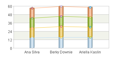
As can be seen, the columns for displaying the event results of each athlete are stacked. Thus you can see the total result of each athlete on the finished chart.
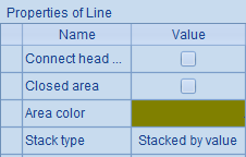
Another type of stacked chart is the one using Percent stacked, which can be plotted by setting the following properties:
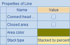
And the plotting result is:
For the chart in which the columns and lines are stacked by percent, data proportions of all series in each category are plotted and the total percent of data in each series is 100%. That way data is compared by percent and the total data value in each category loses its significance.
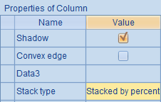
12.7.5 Other properties
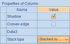
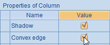
The column element also has special properties: Convex edge and Data3.
Default value of Convex edge property is false; if it is set as true, then the column chart will be plotted with convex edges. Usually this property is used for columns with pure fill colors. Below is a sample plotting algorithm:
|
|
A |
|
1 |
=canvas() |
|
2 |
=demo.query("select * from GYMSCORE") |
|
3 |
=A1.plot("BackGround") |
|
4 |
=A1.plot("EnumAxis","name":"x") |
|
5 |
=A1.plot("NumericAxis","name":"y","location":2) |
|
6 |
=A1.plot("Column","fillColor":[["ChartColor",0,false,-39271,-1,0],["ChartColor",0, false,-13210,-1,0],["ChartColor",0,false,-6697984,-1,0]],"axis1":"x","data1": A2.(EVENT+","+NAME),"axis2":"y","data2":A2.(SCORE)) |
|
7 |
=A1.draw@p(450,200) |
Set fill color property for the column chart in A6:
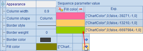
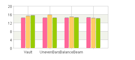
Note: Her gradient color isn’t used. This is unlike the setting when discussing the appearance properties of the column element. First let’s look at the case without setting the convex edge, as A7’s plotting result shows:
Then modify the chart properties of the column element by editing A6’s parameters:
And get the following plotting result:
It can be seen that the columns have got the convex edges. The Convex edge property applies in the 3D column chart as well, while it is invalid for a cylinder chart.
As mentioned in the first section, you just need to define one pair of coordinates to position a column and to plot the whole column chart automatically according to the height of the numeric axis. Columns will be plotted starting from the x-axis to the positions specified by the coordinates. If you want to plot columns from a non-default point, set Data3 to change the start position.
Go on to modify the column element properties by editing A6’s code:
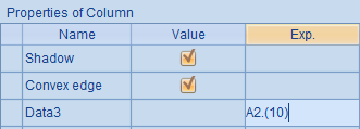
One point to note when setting Data3: The logical axis on which the data depends is the data property Axis 2. Its setting requires a sequence with the same length as in the setting of other data properties. Because the value of Data3 in the above is set as 10 for each column, columns will be plotted from the position whose numeric value on y-axis is 10, rather than from the x-axis. Thus the plotting result of A7 is:
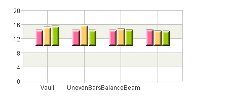
By setting Data3, you can plot charts with special requirements, displaying the opening prices and closing prices of stocks in a stock chart, for example.