The Axis Element
Coordinate Axes explained the basic uses of different logical axes and settings of their properties. Once the logical axes are properly defined, the logical coordinates can be transformed into the corresponding physical coordinates, according to which a certain chart element can be plotted.
A logical axis esProc uses in plotting a chart to handle the coordinate transformation is itself a type of chart element. To plot it, you can specify parameters as needed. The following will illustrate its other properties as a chart element.
12.4.1 Properties of axis line
In The Basics, examples are cited to illustrate how to set the appearance properties like the color, the style and the weight for an axis line. The appearance properties of an axis element also include the arrow styles. For example:
|
|
A |
|
1 |
=canvas() |
|
2 |
=demo.query("select * from GYMSCORE order by NAME") |
|
3 |
=A1.plot("BackGround") |
|
4 |
=A1.plot("EnumAxis","name":"x","axisColor":-16737895,"axisLineWeight":2,"axisArrow":256) |
|
5 |
=A1.plot("NumericAxis","name":"y","location":2) |
|
6 |
=A1.plot("Column","axis1":"x","data1":A2.(EVENT+","+NAME),"axis2":"y","data2":A2.(SCORE)) |
|
7 |
=A1.plot("Legend","legendText":A2.id(NAME),"x":0.81,"y":0.2,"width": 0.18) |
|
8 |
=A1.draw@p(450,250) |
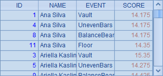
A2 retrieves data for plotting the chart:
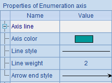
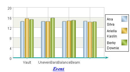
In the plotting algorithm, A4 sets properties for the x-axis, including the line color, line weight and arrow style:
Here’s the plotting result:
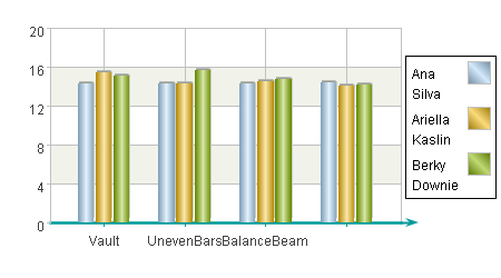
It can be seen that the appearance of x-axis has changed by modifying the chart parameters.
12.4.2 Properties of axis title
You can set a title for an axis to render its data during plotting. The setting of title includes setting properties like font and style. Modify A4 in the plotting algorithm in the previous section into =A1.plot("EnumAxis","name":"x","axisColor":-16737895,"axisLineWeight":2,"axisArrow":256,"title":"Event","titleFont":"Times New Roman","titleStyle":7,"titleColor":-16776961) in which properties of the x-axis title are set as follows:
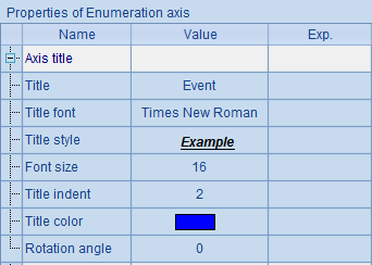
The above settings set the title as Event, select desired title font, and modify Title style and Title color. The distance from title text to tick labels is adjusted by setting the Title indent property and the size of the title text by setting Font size. The tilting angle of the title text is also specified by setting Rotation angle. Then plot the chart according to the modified settings:
As can be seen from the chart, a title exists as plotted below the x-axis.
12.4.3 Properties of axis labels
It is convenient to read statistical values on an axis by displaying tick marks and tick labels as needed. As the axis title, you can set font and style properties for tick labels. For example, modify again the preceding plotting algorithm by editing A4’s code to change the properties of labels on the x-axis:
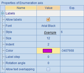
By re-setting the font, style and color of the a-axis labels, the plotting result becomes this:
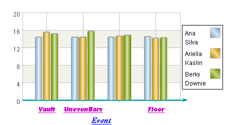
As can be seen, the appearance of tick labels below the x-axis has changed accordingly. The “BalanceBeam”, the third tick label, is omitted by default since it overlaps some parts of the other labels.
Among properties of labels, you can set Indent property to adjust the distance between the title text and tick labels, Rotation angle to change the tilting angle of the title text, Label step to display labels at regular intervals. By checking Allow text overlapping, label text will be plotted even though it might overlap others (By default labels will not overlap each other; a label will not be plotted if it will overlay an existing label, as the third label BalanceBeam in the above chart). Tick labels can be hidden by setting Allow labels as false.
12.4.4 Properties of tick marks
Tick marks are tiny lines added to the axis to mark the scale positions. Their properties such as Style and Weight can be modified in the plotting algorithm. Edit A5 in the previous plotting algorithm to modify properties of tick marks on y-axis:
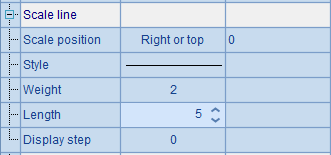
Reposition the tick marks on y-axis to align to the right or to the top and change their weight and length. For the property settings, you can set Display step property to adjust the number of minor tick marks in each interval between major tick marks. With the modification, the plotting result is this:

It can be seen that the tick mark positions on y-axis have changed. Note that when they are changed, positions of tick labels will change accordingly. Besides, the color of tick marks is the same as the axis color.
12.4.5 Properties of grid region
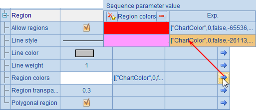
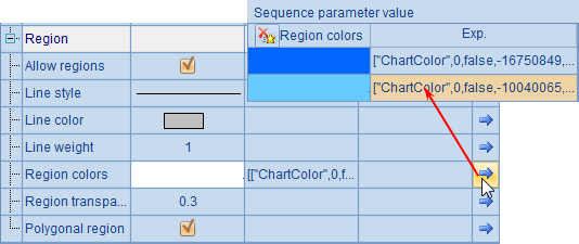
In the coordinate plane, you can plot a region of grid lines according to the major tick marks, so that the chart will look pleasing and become easy to observe. By default white color alternate with dark blue for the grid background of the coordinate axes. The colors can be modified in the chart properties dialog box. Modify the preceding plotting algorithm by editing A5’s code to set the properties for the background grid region of y-axis:
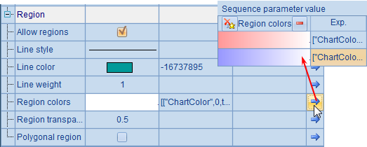
Set Line style as the default solid line, specify values for Line color and Region colors, and change value for Regiontransparency from 1.0 to 0.5. A sequence parameter is used to set the colors of the grid region. Click the right-most arrow button on the property setting dialog box to edit the parameter on a popup window of Sequence parameter value.
According to the above setting, the plotting result is:
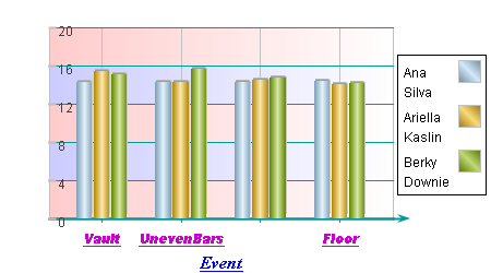
You see that the color of grid region in horizontal direction has changed. With certain colors set for the grid region, transparency needs to be adjusted too. That way, an overlay effect in grid region of different axes will be created.
You can also hide the grid region by setting the property of Allow regions as false.
12.4.6 Polygonal regions in polar coordinates
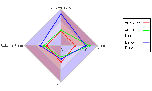
The Polygonal region property is valid only when plotting charts in a polar coordinate system. For example, below is the plotting algorithm of a radar chart for gymnastic results:
|
|
A |
B |
|
1 |
=canvas() |
|
|
2 |
=demo.query("select * from GYMSCORE") |
|
|
3 |
=A1.plot("BackGround") |
=A1.plot("NumericAxis","name":"x","location":3, "autoCalcValueRange":false,"maxValue":16,"minValue":13, "scaleNum":3,"polarLength":0.24) |
|
4 |
=A1.plot("EnumAxis","name":"y","location":4,"gapRatio":-0.5,"labelOverlapping":true) |
=A1.plot("MapAxis","name":"colors","logicalData": A2.id(NAME),"physicalData":[-65536,-16711936,-16776961]) |
|
5 |
for A2.group(NAME) |
=A1.plot("Line","endToHead":true,"closedArea":true, "transparent":0,"lineWeight":2,"lineColor":A5.NAME: "colors","axis1":"x","data1":A5.(SCORE),"axis2":"y", "data2":A5.(EVENT)) |
|
6 |
=A1.plot("Legend","legendText": A2.id(NAME),"x":0.81,"width":0.18, "legendType":3,"legendLineWeight":2, "legendLineColor":A2.id(NAME):"colors") |
|
|
7 |
=A1.draw@p(500,300) |
|
A2 retrieves data for chart plotting. A3 plots a white background. B3 plots a numeric axis, x, as the polar axis, and A4 plots an enumeration axis, y, as the radial axis.
In particular, B4 plots a mapping axis, colors. Its properties are as follows:
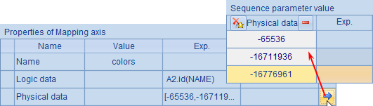
Unlike the logical axis discussed in Coordinate Systems and Transformation, the mapping axis will not transform data values to the coordinates for chart plotting. Instead it is used to convert data values to corresponding property values. Here a one-to-one relationship between names of the athletes and the integer values of colors is created through the mapping axis, colors.
A5 loops through data of each of the athletes, plotting polyline charts for them in B5. Colors of the polylines are set through colors, the mapping axis.
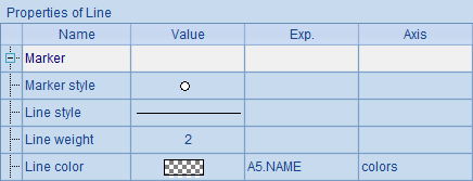
The setting makes colors of polylines for the athletes match the mapping axis setting.
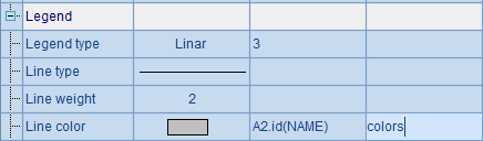
A6 plots the legend using the mapping axis, colors, too:
A7’s plotting result is as follows:
Now let’s study the properties of the polygonal region in the polar coordinate system. Modify A4’s plotting parameters, setting color for the polygonal region of the radial axis, i.e. the enumeration axis y, checking Polygonal region, and changing Region transparency value to 0.3. The modifications are shown below:
Then the plotting result is:
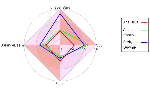
Since polygons have been used in the background region of the radial axis, the polar coordinate planes present themselves as polygons. But, at this time, the polygonal region property for the polar axis hasn’t been checked, so the background is still circles. Modify B3’s chart parameters to set color for the polygonal region of the polar axis, i.e. the numeric axis x, checking Polygonal region and changing Region transparency value to 0.3, as shown below:
Plotting result is:
Thus the background for the polar axis has become polygonal rings. As the transparency of the polygonal regions for both the radial axis and the polar axis is set as 0.3, the finished chart has achieved an effect of color overlay.