The Line Element
The Dot Element discussed how to position a chart element using logical coordinates. Here let’s look at the line element. The line element is another one of the most basic chart elements, which is positioned by at least two pairs of logical coordinates. If there are more logical coordinates, multiple lines can be plotted continuously according to them.
12.6.1 Data properties
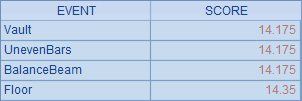
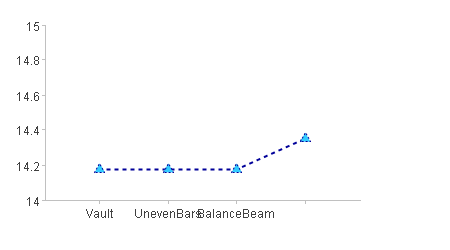
The following plotting algorithm plots a polyline chart for Ana Silva’s results of gym events:
|
|
A |
|
1 |
=canvas() |
|
2 |
=demo.query("select EVENT,SCORE from GYMSCORE where NAME='Ana Silva'") |
|
3 |
=A1.plot("BackGround") |
|
4 |
=A1.plot("EnumAxis","name":"x","allowRegions":false) |
|
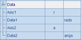
5 |
=A1.plot("NumericAxis","name":"y","location":2,"autoCalcValueRange":false, "maxValue":15,"minValue":14,"allowRegions":false) |
|
6 |
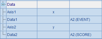
=A1.plot("Line","axis1":"x","data1":A2.(EVENT),"axis2":"y","data2":A2.(SCORE)) |
|
7 |
=A1.draw@p(450,250) |
A1 creates a canvas. A2 retrieves data for chart plotting:
A3 plots the background. A4 plots an enumeration axis as the horizontal axis x. A5 plots a numeric axis as the vertical axis y and sets the maximum and minimum values on it. The Allow regions property for both the horizontal and vertical axes is set as false, which means the grid region on the background will not be plotted and enables a clear view for observing the plotting process.
The following part revolves around the line element plotted in A6. First look at A7’s plotting result:
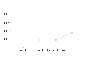
The line element needs at least two pairs of coordinates to be positioned. To define a pair of coordinates needs two logical axes, on which the logical coordinate values will be individually defined.
The logical coordinates A2.(EVENT) and A2(SCORE) are both set as sequences, each containing more than two members to plot multiple lines. You cannot plot a line element with only one pair of logical coordinates.
12.6.2 Appearance properties
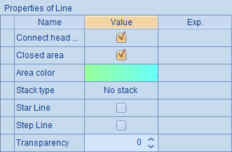
As can be seen from the above chart, the end points and all other data points on the line are dots with automatically generated fill colors. A line element for plotting a polyline chart can be regarded as the dot elements connected with lines. In this sense, appearance properties of the line element are the same as those of the dot element discussed in The Dot Element. Note that in a polyline chart plotting, the lines of the polyline chart and the boundary line of the dots share properties such as line color, line weight and line style. Supposing modify the chart parameters in A6 to set appearance properties for the lines and dots.
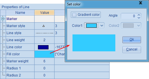
Set the line as dark blue dotted line with 2 pixels’ line weight, the marker style as triangle with 6 pixels’ marker weight and the fill color as light blue. With the modifications, the plotting result is:
You see that the appearance of the line has been changed accordingly.
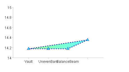
12.6.3 The shaded area
Using line element, you can also make a polyline chart with a shaded area with certain color or certain shape. To do this, modify the chart properties in A6:
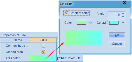
By checking Closed area property and setting Area color property, the plotting result is:
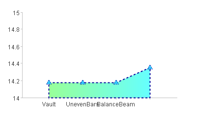
With Closed area property checked, an area between the polyline and the Axis 1 set in the data properties interface is created with certain fill colors.
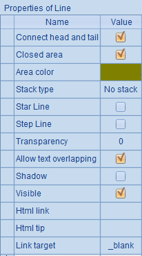
Now check both the Closed area property and the Connect head and tail property, which means modifying the chart properties in A6’s code as follows:
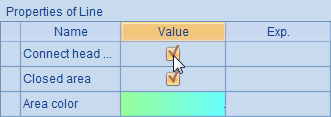
Then you’ll get the following plotting result:
In this case, the shaded area is a closed area formed by connecting the two end points of the polyline.
In particular, to plot a line chart only with end points connected and without fill color, set the fill color transparency as 0 besides checking Closed area and Connect head and tail:
Thus the plotting result would be:
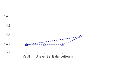
Notice that in this case the data points are transparent too.
12.6.4 Other properties
esProc allows plotting a chart element in different coordinate systems according to the given data properties. For example, plotting a function graph using lines in a polar coordinate system:
|
|
A |
B |
C |
|
1 |
=canvas() |
20 |
>rads=[],angs=[] |
|
2 |
for B1 |
=360*(A2-1)/B1 |
=1+cos(B2*pi()/180) |
|
3 |
|
>angs=angs|B2 |
>rads=rads|C2 |
|
4 |
=A1.plot("BackGround") |
|
|
|
5 |
=A1.plot("NumericAxis","name":"r","location":3, "scaleNum":2,"regionLineStyle":0,"regionTransparent":0.6) |
|
|
|
6 |
=A1.plot("NumericAxis","name":"a","location":4, "autoCalcValueRange":false,"maxValue":360,"scaleNum":6,"regionLineStyle":0,"regionTransparent":0.6) |
|
|
|
7 |
=A1.plot("Line","endToHead":true,"closedArea":true, "transparent":0,"markerStyle":0,"axis1":"r","data1":rads, "axis2":"a","data2":angs) |
|
|
|
8 |
=A1.draw@p(350,250) |
|
|
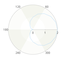
The above plotting algorithm plots a cardioid using lines. B2 sets the sample size. The code in the second and third line calculates by loop the coordinate values of the sample points and records their radial and angular coordinates in parameters rads and angs. A5 sets a numeric axis r as the polar axis without grid lines and with the background region transparency being 0.6. A6 sets numeric axis a as the radial axis, setting the maximum angle as 360 degrees and the same background region properties as the polar axis.
A7 plots the line elements by setting data properties, checking Connect head and tail and Closed area properties, and specifying the fill color transparency as 0 and that no data points will be plotted:
Below is the plotting result:
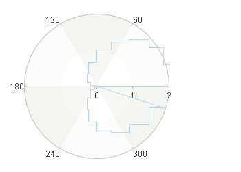
Now let’s learn about the line element’s other properties by modifying the plotting algorithm.
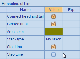
By setting Star Line property as true, you will not plot a polyline chart; instead, each end point will be connected with the original point to produce a sun ray plot. That would be the result by modifying A7’s chart parameters:
Below is the plotting result in A8:
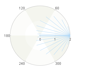
This sun ray plot cannot form a closed area, so the checked properties like Connect head and tail, Closed area and Area color are invalid.
Proceed to modify the chart parameters by checking the Step line property:
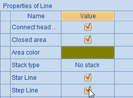
You’ll get a plotting result like this:
By checking Step Line, neighboring points on the line will be connected by a vertical straight line and a horizontal straight line, instead of a single straight line. Thus a ladder-like line chart will be plotted. This property is useful in plotting charts like a pulse sequence diagram. With Step Line checked, Star Line is invalid.
In addition, you can set Stacking type property to plot a stacked area chart with multiple series and categories. Detailed discussion about this property is available in the section of Stacked column chart in The Column Element.