Text Element & Background Element
In esProc, it is common to add text to various charts. The text is plotted and positioned with the text element, and has its own style compared with text working with other chart elements (though the latter’s properties can be adjusted in a similar way).
12.9.1 Data properties
The text element has a relatively simple function. It defines specified text in a given position. The text element is positioned using physical axes, rather than the logical axes.
The following plotting algorithm shows how to use the text element:
|
|
A |
|
1 |
=canvas() |
|
2 |
=demo.query("select * from FRUITS") |
|
3 |
=A1.plot("BackGround") |
|
4 |
=A1.plot("EnumAxis","name":"x","xStart":0.2,"xEnd":0.9,"xPosition":0.7) |
|
5 |
=A1.plot("NumericAxis","name":"y","location":2,"yStart":0.7,"yPosition":0.2) |
|
6 |
=A1.plot("Column","axis1":"x","data1":A2.(NAME),"axis2":"y","data2": A2.(UNITPRICE)) |
|
7 |
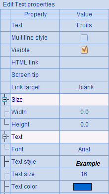
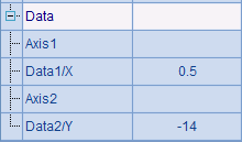
=A1.plot("Text","text":"Fruits","textFont":"Arial","textStyle":3,"textSize":16,"textColor":-16750900,"data1":0.5,"data2":-30) |
|
8 |
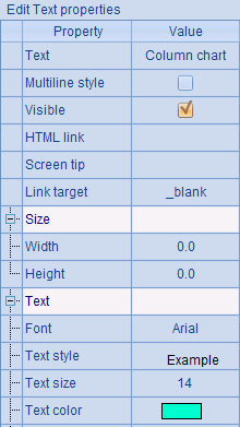
=A1.plot("Text","text":"Column chart","textFont":"Arial","textSize":14,"textColor": -16711732,"data1":0.5,"data2":-14) |
|
9 |
=A1.draw@p(300,200) |
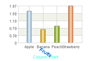
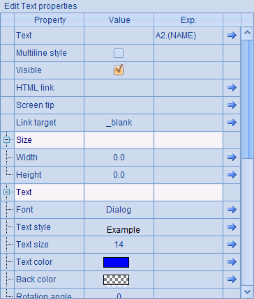
This is an algorithm for plotting a column chart. It uses the text element to add text in A7 and A8 besides defining the background, axes and the column element. Properties of text are as follows:

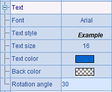
The text element is defined by setting data right through its properties, as well as by using coordinate parameters X and Y to position the physical axes. Here X value is set with physical coordinates calculated pro rata, and Y value set by pixels. Which method should be used to define the coordinate value is determined by the value range.
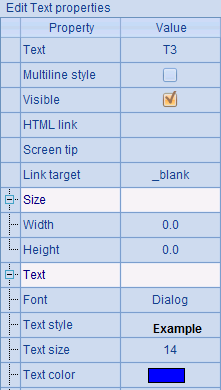
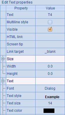
The properties of the text element include the text font, text style, text size and text color, which are the same for text properties of other chart elements. Here A7 specifies size-3 blue text in bold italic type. A8 only modifies the text color.
Plotting result is:
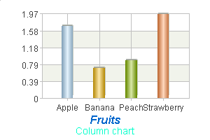
A chart title has been added in the specified position.
The text can be rotated by changing the text element’s Rotation angle property. For instance, modifying the chart parameter in A7 to change this property:
This way the text Fruits will rotate clockwise around the specified coordinate point.
12.9.2 Positioning the text element
The text element is positioned using physical coordinates, as with the positioning of logical coordinates discussed in Coordinate Systems and Transformation. If the range of the coordinate value is 0<= x <=1, set the value in proportion to the size of the canvas; if the range is x>1 or x<0, set it by pixels.
A grid region will be plotted using the following plotting algorithm to show positions of texts more clearly:
|
|
A |
|
1 |
=canvas() |
|
2 |
=A1.plot("BackGround") |
|
3 |
=A1.plot("NumericAxis","name":"x","autoCalcValueRange":false,"scaleNum":10, "xStart":0,"xEnd":1,"xPosition":1,"regionTransparent":0.5) |
|
4 |
=A1.plot("NumericAxis","name":"y","location":2,"autoCalcValueRange":false, "scaleNum":10,"yStart":1,"yEnd":0,"yPosition":0,"regionTransparent":0.5) |
|
5 |
=A1.plot("Dot","axis1":"x","data1":5,"axis2":"y","data2":5) |
|
6 |
=A1.draw@p(300,200) |
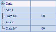
A2 plots the background. A3 and A4 plot axes that define the chart area; one is located in the leftmost edge and the other located at the bottom. The Autocalc value range property for both axes is set as false, so that default value range [0,10] can be activated. By setting Region transparency as 0.5, an overlapping effect is created through the grid region. For the convenience of observation, A5 plots a dot at the center of the region. Here’s A6’s plotting result:
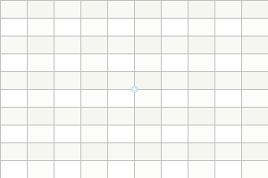
Both axes in horizontal and vertical direction are evenly divided into 10 scales. Since the size of the grid region is 300*200, one scale in horizontal direction is 30 pixels and one in vertical direction is 20 pixels. Then four text elements will be plotted in different positions in the grid region:
|
|
A |
|
1 |
=canvas() |
|
2 |
=A1.plot("BackGround") |
|
3 |
=A1.plot("NumericAxis","name":"x","autoCalcValueRange":false,"scaleNum":10, "xStart":0,"xEnd":1,"xPosition":1,"regionTransparent":0.5) |
|
4 |
=A1.plot("NumericAxis","name":"y","location":2,"autoCalcValueRange":false, "scaleNum":10,"yStart":1,"yEnd":0,"yPosition":0,"regionTransparent":0.5) |
|
5 |
=A1.plot("Dot","axis1":"x","data1":5,"axis2":"y","data2":5) |
|
6 |
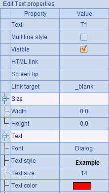
=A1.plot("Text","text":"T1","textStyle":1,"textColor":-65536,"data1":0.4,"data2":0.4) |
|
7 |
=A1.plot("Text","text":"T2","textStyle":1,"textColor":-65281,"data1":0.4,"data2":0.8) |
|
8 |
=A1.plot("Text","text":"T3","textStyle":1,"textColor":-16776961,"data1":60,"data2":60) |
|
9 |
=A1.plot("Text","text":"T4","textStyle":1,"data1":-60,"data2":-60) |
|
10 |
=A1.draw@p(300,200) |
Different coordinates and different text colors are set for the four text elements plotted in four positions, all in boldface but without setting the alignment property:


Without setting the alignment property, the specified coordinate point is in the middle position relative to each of the text elements. Below is the plotting result:
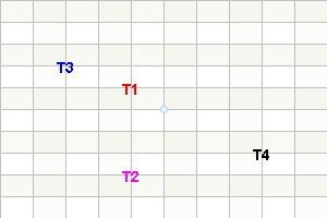
From the chart, you can see the position of each text element relative to the physical axes.
We can also position a text element by specifying coordinate values on coordinate axes. To add a text element in the chart, for instance, we can modify the first plotting program at the beginning of this chapter:
|
|
A |
|
1 |
=canvas() |
|
2 |
=demo.query("select * from GYMSCORE where EVENT = 'Vault'") |
|
3 |
=A1.plot("NumericAxis","name":"y","location":2,"labelFont":"Calibri", "labelOverlapping":true) |
|
4 |
=A1.plot("EnumAxis","name":"x","categories":A2.(NAME), "labelFont":"Arial") |
|
5 |
=A1.plot("Column","axis1":"x","data1":A2.(NAME),"axis2":"y", "data2":A2.(SCORE),"text":A2.(SCORE)) |
|
6 |
=A1.plot("Text","text":A2.(NAME),"textColor":-16776961,"axis1":"x","data1":A2.(NAME),"axis2":"y","data2":A2.(SCORE+1)) |
|
7 |
=A1.draw@p(450,350) |
A6 plots a text element on the top of each column according to the following property configrurations:
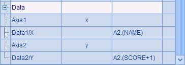
The text in each text element is player’s name in blue. The configurations of coordinate axes and coordinate values for positioning the text element are much the same as those for plotting a column chart. The y-coordinate is made greater to place the text at the top of each column. Below is A7’s plotting result:
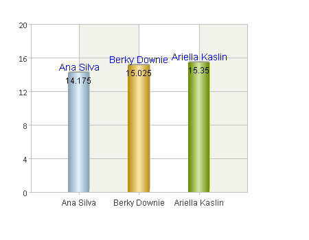
By configuring coordinate axes, we can position a text element through a pair of coordinate values.
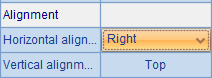
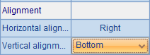
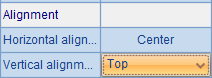
12.9.3 Alignment property
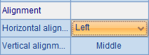
Beside the specification of coordinate point, you can also adjust the relative position between the coordinate position and the text by setting alignment property, as shown in the following plotting algorithm:
|
|
A |
|
1 |
=canvas() |
|
2 |
=A1.plot("BackGround") |
|
3 |
=A1.plot("NumericAxis","name":"x","autoCalcValueRange":false,"scaleNum":10, "xStart":0,"xEnd":1,"xPosition":1,"regionTransparent":0.5) |
|
4 |
=A1.plot("NumericAxis","name":"y","location":2,"autoCalcValueRange":false, "scaleNum":10,"yStart":1,"yEnd":0,"yPosition":0,"regionTransparent":0.5) |
|
5 |
=A1.plot("Dot","axis1":"x","data1":5,"axis2":"y","data2":5) |
|
6 |
=A1.plot("Text","text":"T1","textStyle":1,"textSize":22,"textColor":-65536,"hAlign":0,"data1":0.5,"data2":0.5) |
|
7 |
=A1.plot("Text","text":"T2","textStyle":1,"textSize":22,"textColor":-65281,"hAlign":4,"vAlign":8,"data1":0.5,"data2":0.5) |
|
8 |
=A1.plot("Text","text":"T3","textStyle":1,"textSize":22,"textColor":-16776961,"hAlign":4,"vAlign":32,"data1":0.5,"data2":0.5) |
|
9 |
=A1.plot("Text","text":"T4","textStyle":1,"textSize":22,"vAlign":8,"data1":0.5,"data2":0.5) |
|
10 |
=A1.draw@p(300,200) |
Still, four texts T1, T2, T3 and T4 are plotted, with each of the physical coordinates for them set as 0.5, that is, the specified coordinate point is the center of the canvas, where a referential dot is plotted. Moreover, the font size is increased and boldface type is used to create a clearer view. And different alignment properties and different colors are set for them.
Then the plotting result is:
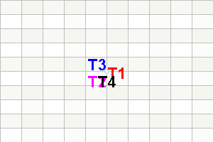
It can be seen how the alignment property works. Though the four text elements are defined with the same coordinate point, which is the center of the canvas, the result is that for T1, the coordinate point is situated on the middle left; for T2, it is on the top right; for T3, it is on the bottom right and for T4, it is on the top middle. These are in consistent with the settings of the alignment property for them.
12.9.4 Barcode
In a text element, we can use barcode to present text. For example:
|
|
A |
|
1 |
=canvas() |
|
2 |
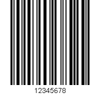
=A1.plot("Text","text":"12345678","barType":3,"dispText":true) |
|
3 |
=A1.draw@p(200,200) |
As shown below, you can set the barcode property, which is the last of the text properties:
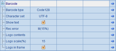
A barcode is displayed according to the type and character set you select. The following is the barcode the above script plots:
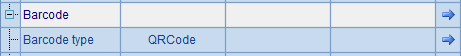
According to the selected type, you can display a two-dimensional barcode (or a QR code):
|
|
A |
|
1 |
=canvas() |
|
2 |
=A1.plot("Text","text":"http://www.raqsoft.com","barType":256,"dispText":true) |
|
3 |
=A1.draw@p(200,200) |
The barcode type is as follows:
Here’s the QR code A3 draws:

12.9.5 Background element
Besides selecting a color for a background element, we can also plot an image in it:
|
|
A |
|
1 |
=canvas() |
|
2 |
=A1.plot("BackGround","imageValue":"D:\\soft\\raqsoft2022\\esProc\\logo\\logo.png") |
|
3 |
=A1.draw@p(200,200) |
The following sets an image value for the background element:
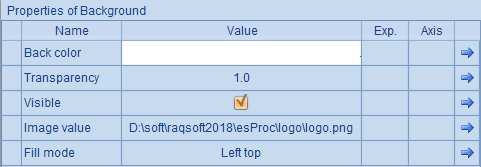
Here’s the final background:

There are 3 fill modes – left top, stretch and tile.