12.3.3 Enumeration axis
An enumeration axis is used in plotting a chart comparing data of various categories, or of different series. A chart can be positioned according to the categories/series on an enumeration axis. Unlike a numeric axis, coordinate values on an enumeration axis are inconsecutive.
A sequence of names of all categories or series should be specified during plotting an enumeration axis in order to calculate physical coordinates from values of a certain category or series.
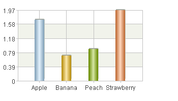
Below is the algorithm of plotting a column chart comparing unit prices of fruits:
|
|
A |
|
1 |
=canvas() |
|
2 |
=demo.query("select * from FRUITS") |
|
3 |
=A1.plot("BackGround") |
|
4 |
=A1.plot("EnumAxis","name":"x","categories":A2.(NAME)) |
|
5 |
=A1.plot("NumericAxis","name":"y","location":2) |
|
6 |
=A1.plot("Column","axis1":"x","data1":A2.(NAME),"axis2":"y","data2": A2.(UNITPRICE)) |
|
7 |
|
|
8 |
=A1.draw@p(350,200) |
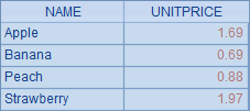
A2 retrieves data for plotting the chart from the database:
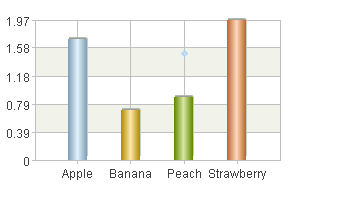
A3 plots a white background. A4 sets x-axis as the enumeration axis and defines a sequence of categories, which is a sequence of fruit names. A5 sets y-axis as the numeric axis and calculates value range automatically. A6 plots the column chart according to logical coordinates composed of fruit name and unit price. A8’s plotting result is as follows:
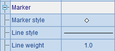
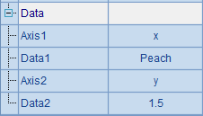
To demonstrate the transformation of coordinates on the enumeration axis more clearly, enter code (=A1.plot("Dot","markerStyle":6,"axis1":"x","data1":"Peach","axis2":"y","data2":"1.5")) in A7 to plot a dot, whose properties are set as follows:
Below is the plotting result in which position of the point ["Peach",1.5] can be seen:
If the categories and series on the enumeration axis aren’t specified, the data would be analyzed automatically based on the chart element for which the enumeration axis was plotted.
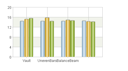
An enumeration axis can hold both categories and series together, like the following plotting algorithm of a gymnastic scores chart:
|
|
A |
|
1 |
=canvas() |
|
2 |
=demo.query("select * from GYMSCORE") |
|
3 |
=A1.plot("BackGround") |
|
4 |
=A1.plot("EnumAxis","name":"x") |
|
5 |
=A1.plot("NumericAxis","name":"y","location":2) |
|
6 |
=A1.plot("Column","axis1":"x","data1":A2.(EVENT+","+NAME),"axis2":"y","data2":A2.(SCORE)) |
|
7 |
|
|
8 |
=A1.draw@p(450,250) |
A2 retrieves data for plotting the chart from the database:
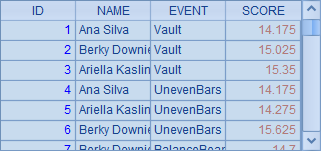
A3 plots a white background. A4 sets x-axis as the enumeration axis and analyzes data automatically; A5 sets y-axis as the numeric axis. A6 plots the column chart. When using categories and series together, the logical coordinate on the enumeration axis should include both the category value and series value separated by a comma, like "Vault, Becky Downie".
Plotting result of A8 is as follows: